To create a visual identity that reflects Paacho’s ethos of blending poise, artistry, confidence, harmony, and originality.
Brand Philosophy
Paacho is rooted in the idea of celebrating Indian craftsmanship with a contemporary twist. Its name derives from “five” – a nod to the five elements (Poise, Artistry, Confidence, Harmony, and Originality) that define the brand. The challenge was to craft a logo and visual identity that honor these principles while staying modern and elegant. Each design element was carefully chosen to reflect the richness of tradition while embracing minimal, modern aesthetics. The final identity captures Paacho’s spirit timeless, bold, and deeply connected to its roots.
The Five Pillars of Paacho
The goal was to design a brand identity for Paacho that communicates :
Logo Concept
The Paacho logo embodies simplicity, tradition, and creativity. It seamlessly bridges the gap between classic Indian textiles and the modern sensibilities of today’s global audience.
Poise
Graceful form with balanced, elegant structure.
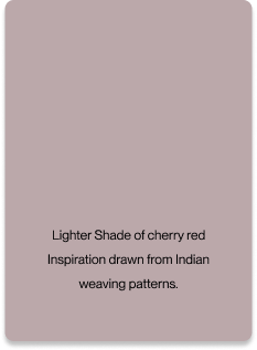
Artistry
Inspiration drawn from Indian weaving patterns.
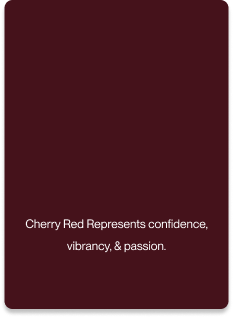
Confidence
Bold typography with a distinct visual presence.
Harmony
Smooth curves with perfect geometric symmetry.
Originality
Traditional motifs blended with minimalism.
Colour Pallette
The color palette reinforces the brand’s modern yet classic appeal :
Brand Typography
A contemporary serif typeface was selected for the primary logo, emphasizing sophistication and modernity. For secondary text, clean sans-serif fonts were used, ensuring readability and a professional look. This combination creates a harmonious visual hierarchy that enhances brand communication.
Identity Prism
The identity prism outlines Paacho’s brand personality and consumer perception:
Crafting the Logo
The creation of the Paacho logo was a meticulous process, combining visual storytelling and typographic artistry.
the logo
By blending the double “A” in Paacho into a unified, flowing element, our logo design creates a distinct visual identity while symbolizing connection, creativity, and harmony. This thoughtful integration reflects Paacho’s mission of bringing brands and people closer together. The design follows current branding trends and leverages visual psychology to ensure it feels both modern and memorable.
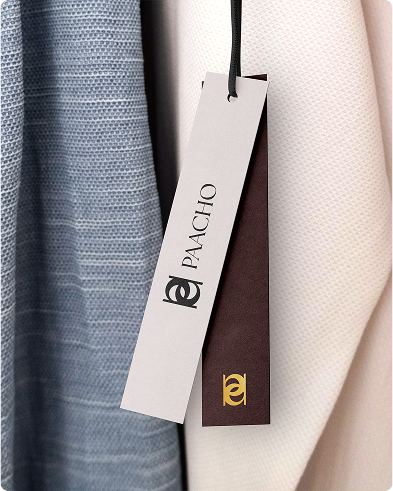
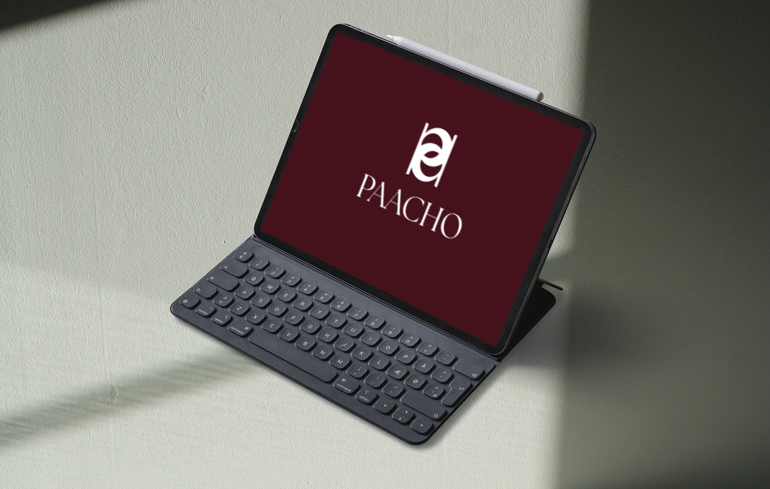
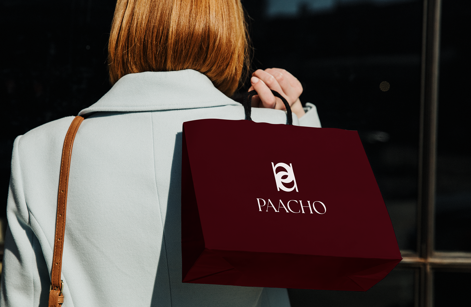
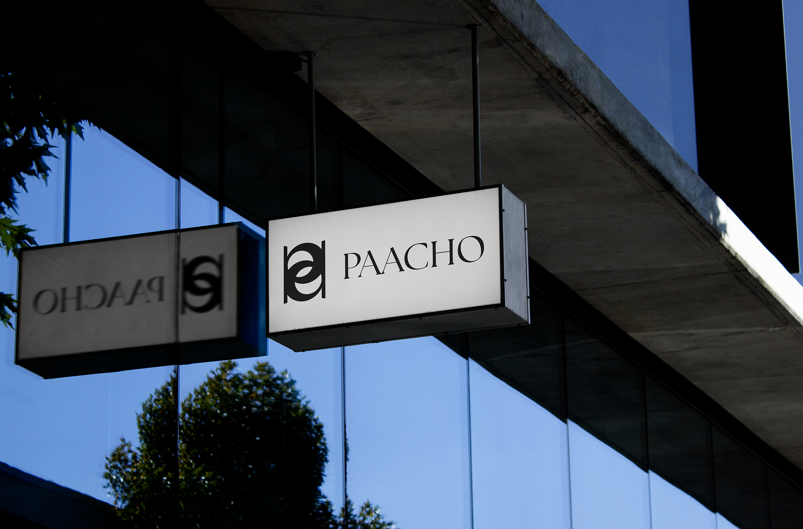
logo Types
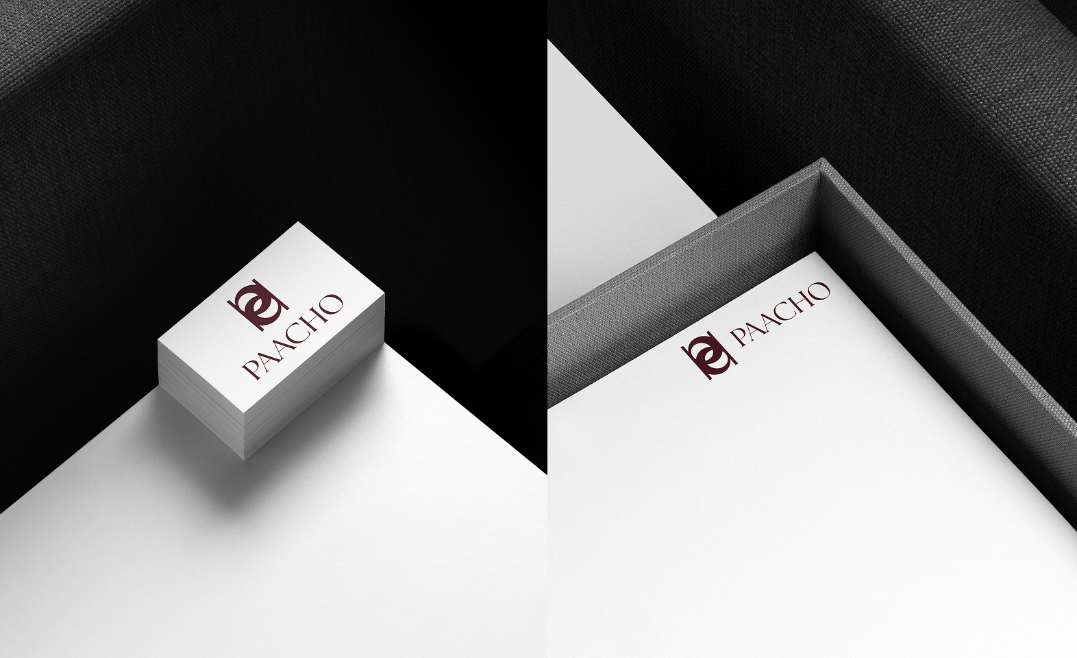
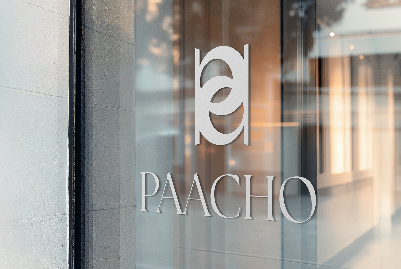
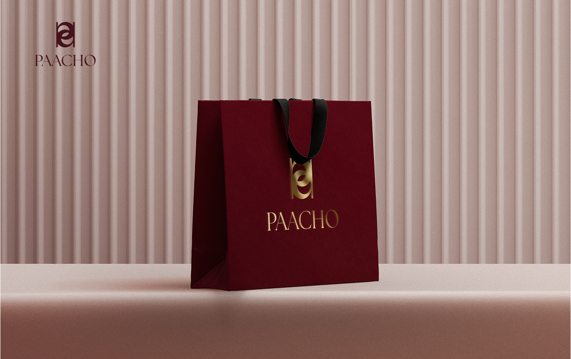
The Paacho logo is a flexible brand asset designed to adapt seamlessly across diverse contexts and applications. Each variation preserves the core identity and spirit of the brand, ensuring a consistent and recognizable presence at every touchpoint. Whether showcased on digital platforms, printed materials, or product packaging, the logo maintains clarity, balance, and visual impact.
Typography
The typography used for PAACHO is a modern serif typeface with small strokes at the ends (serifs), typical of classic or formal styles, ensuring a consistent and recognizable presence across all touchpoints. The sharp contrast between thick and thin strokes, combined with all-uppercase letters, gives the brand a luxurious, fashion-forward feel. The central “pa” symbol is a stylized monogram merging the letters “p” and “a” in a symmetrical, geometric form- a technique often used to create a distinctive visual identity. Letterforms like the clean, rounded “C,” the tall, narrow “H,” and the slightly ovoid “O” reflect Didot-style elegance and contribute to a refined vertical rhythm- a hallmark of luxury branding that evokes uniqueness and grace.
Symbolism
The design incorporates abstract motifs that resemble weaving looms and threads, paying homage to artisans and their heritage.
Balance
The harmony between negative and positive spaces ensures a timeless, elegant feel. This balance enhances legibility while maintaining a refined aesthetic. It creates visual breathing room, allowing each letterform to stand out with clarity and grace.
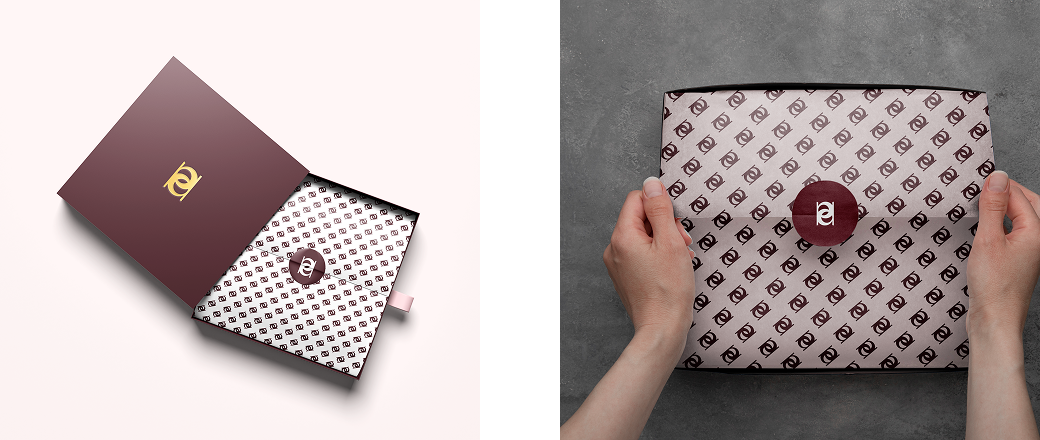
Brand Pattern
The PAACHO brand pattern draws inspiration from the geometric elegance of its monogram, incorporating symmetrical curves and clean lines. Repeating elements from the “pa” symbol create a visually cohesive backdrop that complements the brand’s refined aesthetic. This pattern reinforces identity across packaging, print, and digital touchpoints while maintaining a sense of sophistication and subtlety.
Outcome
The brand identity successfully captures Paacho’s essence and appeals to its target audience. The combination of poise, artistry, and originality creates a distinctive, memorable presence in the fashion industry.