Career Change is a Personal Brand by Bhavya Garg dedicated to helping professionals navigate career transitions. Recognizing the need for a strong brand identity that would resonate with individuals seeking for career growth and change, Career Change partnered with MADnext to launch its Identity. MADnext helped Career Change develop a cohesive brand identity, including logo design, book covers, merchandise, brand guidelines and dedicated website of Bhavya Garg. The objective of the website is to engage individuals looking for career change.
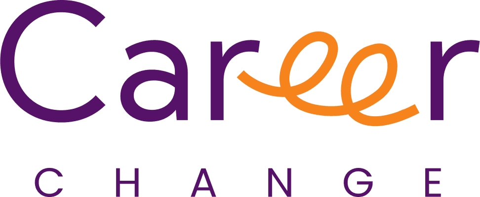
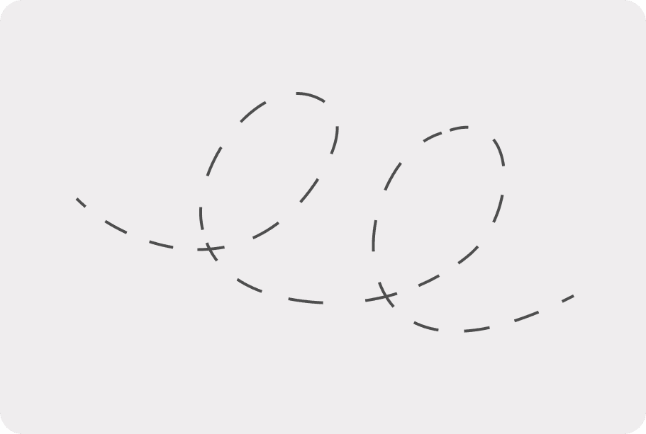
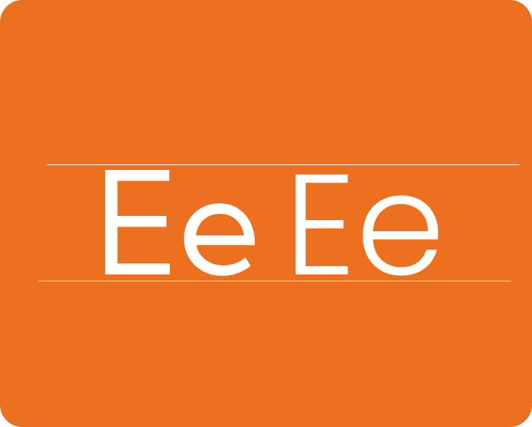
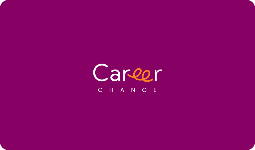
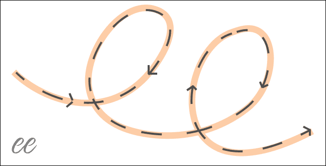
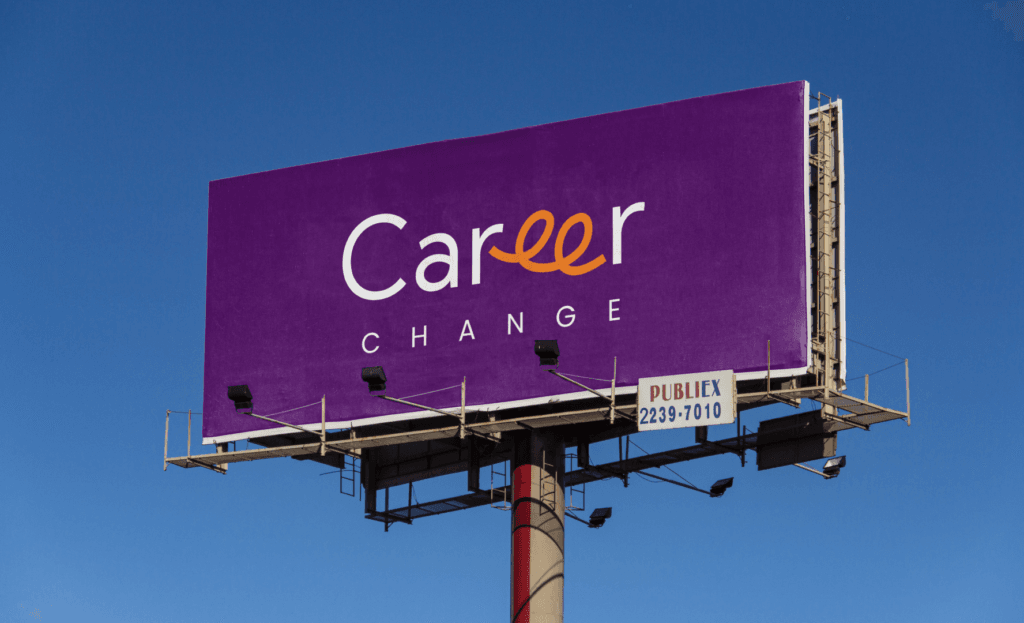
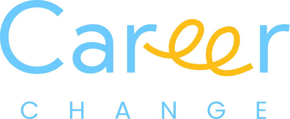
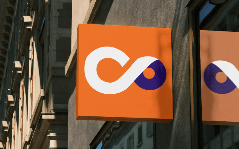
The logo for career change incorporates the letters “EE” as a continuous loop, symbolizing the process of exiting one career path and entering another.
The loop signifies fluidity, movement, and transformation, essential elements in the journey of a career change. This design emphasizes the idea of continuous growth and the seamless transition from one phase to another.
Bhavya Garg
Counsellor
Contact Number
Contact Number
Uses an “in” symbol enclosed in a box, signifying connection and professional networking. Similarly, our “EE” loop symbolizes interconnectedness and the journey through various career phases.
Continuity and Trust: Circles and loops are often associated with trust and reliability in design psychology. The “EE” loop conveys a sense of security and reassurance, crucial for individuals facing the uncertainty of career change.
Growth and Progress: The upward or outward movement implied by the loop suggests personal and professional growth, resonating with individuals seeking career advancement.
By integrating the “EE” as a loop, our career change logo not only stands out visually but also embodies the essential qualities of modern career transitions—fluidity, growth, and endless possibilities. This design aligns with industry trends and leverages psychological principles to create a logo that is both meaningful and impactful.
Growth and Progress: The upward or outward movement implied by the loop suggests personal and professional growth, resonating with individuals seeking career advancement.
Challenge
As a new personal brand, Career Change faced some key challenges
Establishing a Unique Identity: Career Change needed an identity that stood out in the crowded career development industry, appealing to professionals from various backgrounds.
Creating a Memorable Logo: It required a logo that encapsulated its mission of guiding individuals through career transitions, while also being modern and versatile.
Designing Consistent Visual Elements: Career Change needed a unified design approach for book covers, merchandise, and other brand assets to maintain consistency and enhance brand recognition.
Developing Comprehensive Brand Guidelines: It needed clear brand guidelines to ensure consistency across all marketing and communication channels.
Version.01 | 2023
Brand Guidelines
Curated by MADnext
INDEX
introduction
brand story
Career Change School was born from the belief that everyone deserves a fulfilling career. We empower individuals to confidently navigate transitions with personalized guidance, practical resources, and a supportive community. Our commitment is to provide the tools and knowledge needed for successful career changes, transforming aspirations into reality. Join us in rewriting your professional story.
LOGO
the logo
By integrating the “EE” as a loop, our career change logo not only stands out visually but also embodies the essential qualities of modern career transitions—fluidity, growth, and endless possibilities. This design aligns with industry trends and leverages psychological principles to create a logo that is both meaningful and impactful.
logo types
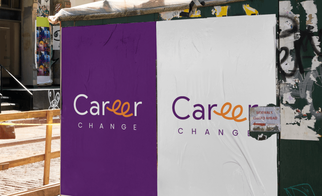
career change logo is a versatile asset that comes in various forms to adapt to different context and applications. each integration maintain its integrity and essence of our brand, ensuring consistent representation across all touchpoints. weather it is displayed on digital, print or metal surfaces our logo serves with neat clarity.
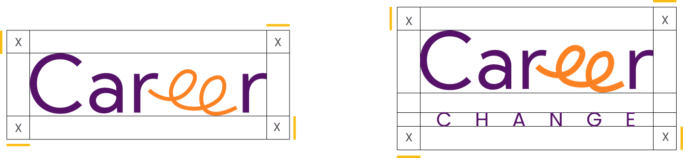
construction
The logo for career change incorporates the letters “EE” as a continuous loop, symbolizing the process of exiting one career path and entering another. The loop signifies fluidity, movement, and transformation, essential elements in the journey of a career change. This design emphasizes the idea of continuous growth and the seamless transition from one phase to another.
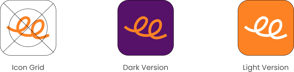
ICON
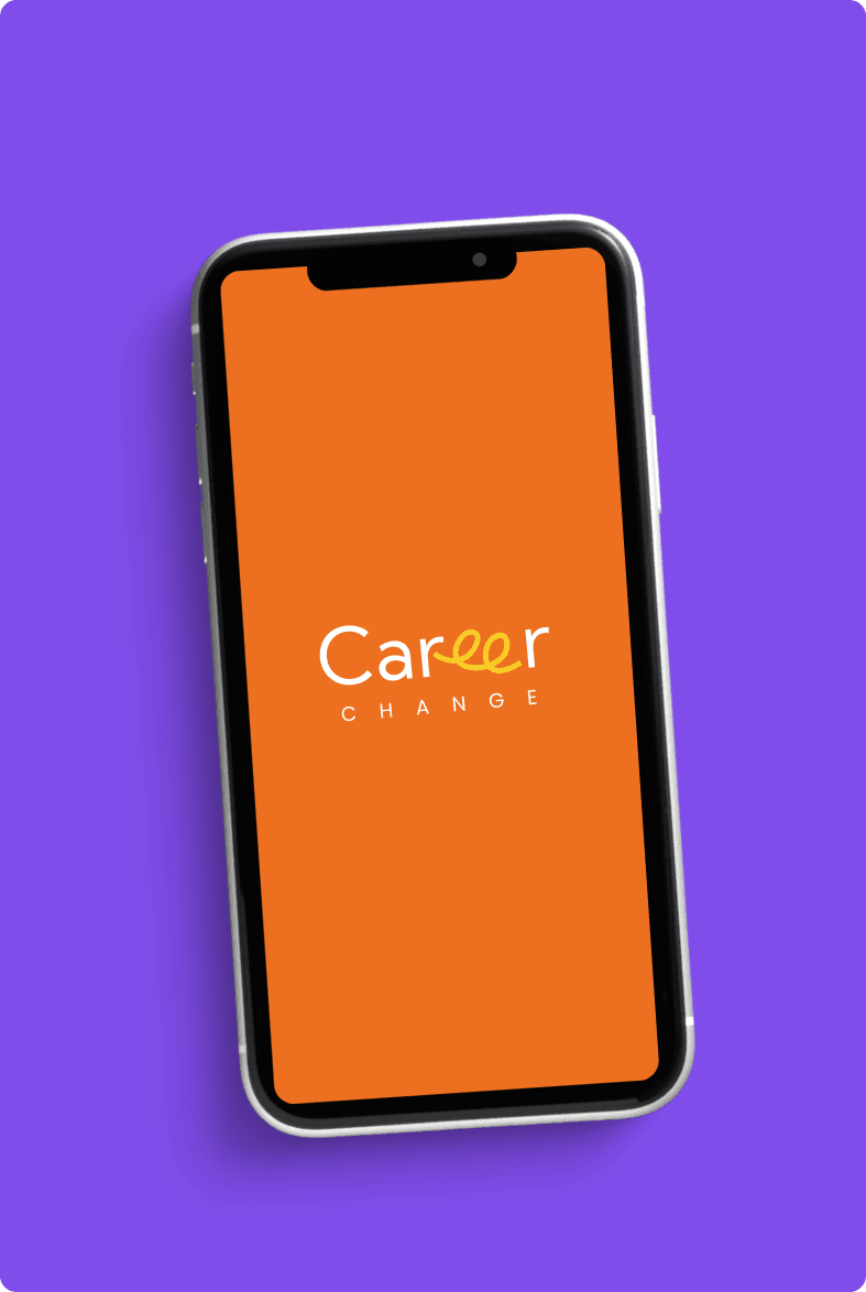
social or app icon of career change is a modern interpretation of our logo, optimized for digital platforms. its lean lines and neat presence make it instantly recognizable, while simplicity ensures clarity and legibility on screens of all sizes.
clear space
when using icon or logo it is important to leave enough space around them. for a logo the clear space should beat least half of it’s monogram size to maintain its visual clarity. this will help create a clean and uncluttered appearance, which will allow the logotype to stand
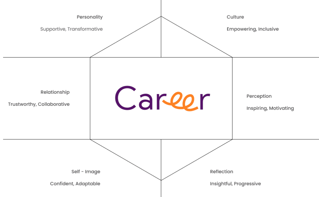
identity prism
brand identity prism encapsulates the multifaceted nature of our brand, encompassing its essence, values, and aspirations. From our strong personality to our vibrant culture, each facet reflects who we are and what we stand for. It serves as a guiding framework that shapes our interactions, relationships, and perceptions, both internally and externally.
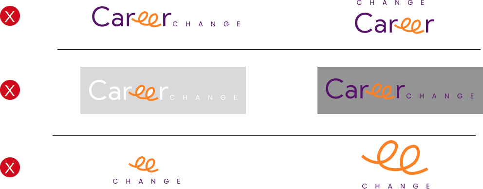
logo crimes
a symbol of our brand’s integrity and excellence, and it is essential to protect its integrity at all times. To prevent misuse, it is imperative to adhere to our logo usage guidelines, ensur-ling proper placement, proportion, and color usage. By upholding these standards, we preserve the strength and credibility of the Webuild brand, safeguarding it against any misrepresentation or dilution.
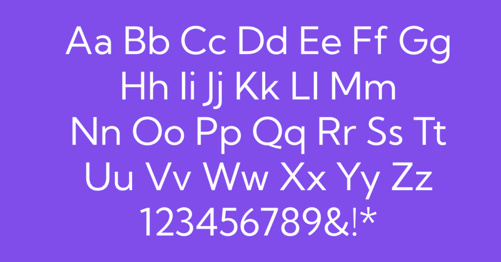
typography
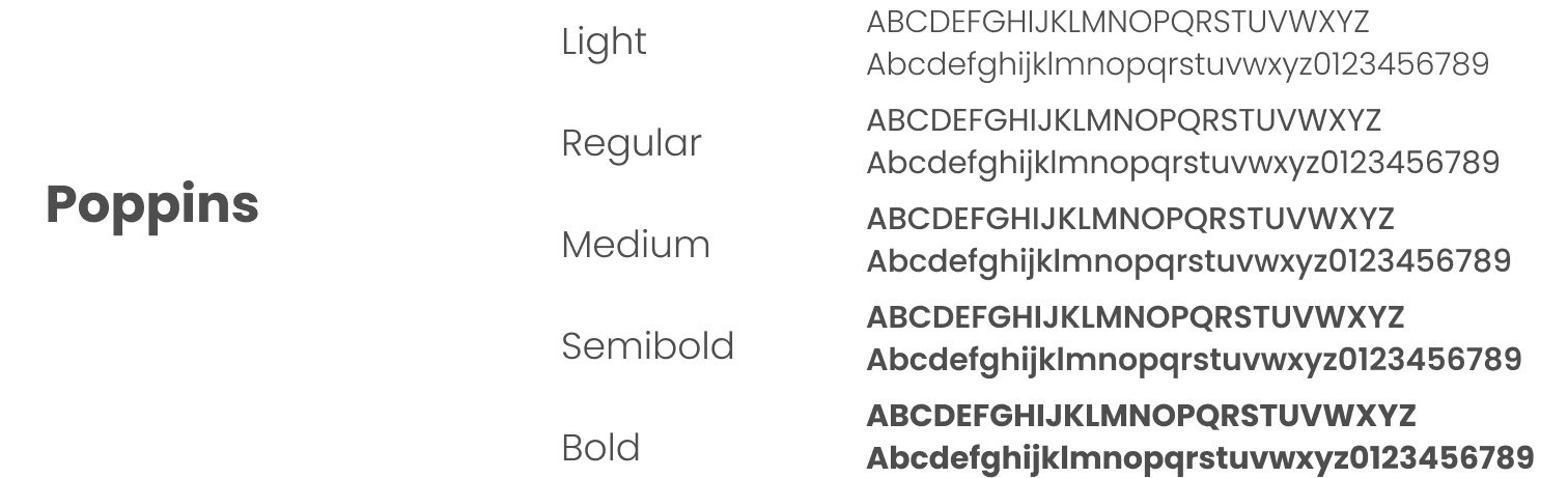
typography
Poppins is a great choice for the Career Change brand due to its modern and clean design, which enhances readability and professionalism. Its geometric simplicity and versatility align with the brand’s values of clarity, transformation, and seamless transition.
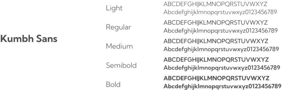
typography
Kumbh Sans is an excellent alternative for the Career Change brand because of its contemporary and approachable design. Its balanced, clean lines and legibility align with the brand’s emphasis on clarity and professional growth, making it a suitable choice for communicating transformation and fluidity.
colors
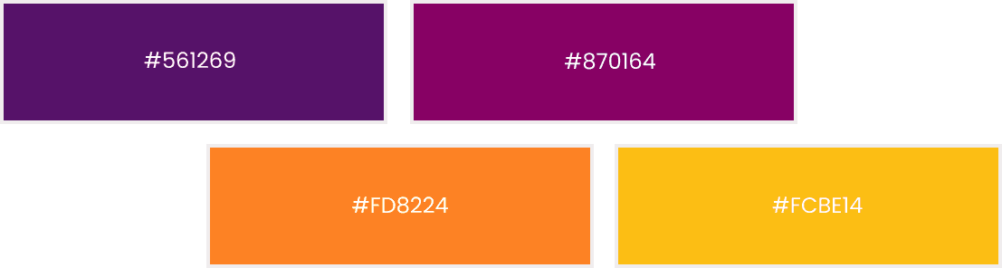
colors
Purple signifies creativity, wisdom, and ambition, aligning with the transformative aspect of career change. Orange represents enthusiasm, energy, and encouragement, which are essential for motivating individuals during transitions. Magenta embodies innovation and balance, reflecting the blend of professional and personal growth. Yellow symbolizes optimism, clarity, and positivity, reinforcing the brand’s commitment to empowering individuals with a bright outlook.
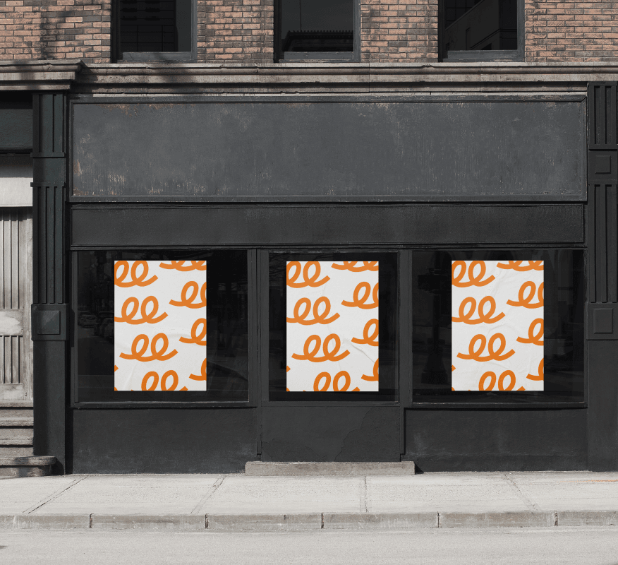
brand pattern
brand pattern
Our brand pattern embodies the seamless fusion of cutting-edge technology and eco-conscious innovation, weaving a narrative of sustainable elegance. It reflects a commitment to excellence, driving change, and enhancing the future of mobility through sophisticated design and unparalleled performance.
Solutions
MADnext approached the project with a strategic plan focused on building a strong and cohesive brand
Logo Design: MADnext’s design team crafted a logo that symbolizes transformation and growth. The design incorporated elements that represented both stability and progress, reflecting the essence of Career Change. The logo was designed to be adaptable across various mediums, from digital platforms to physical merchandise, ensuring versatility and recognition.
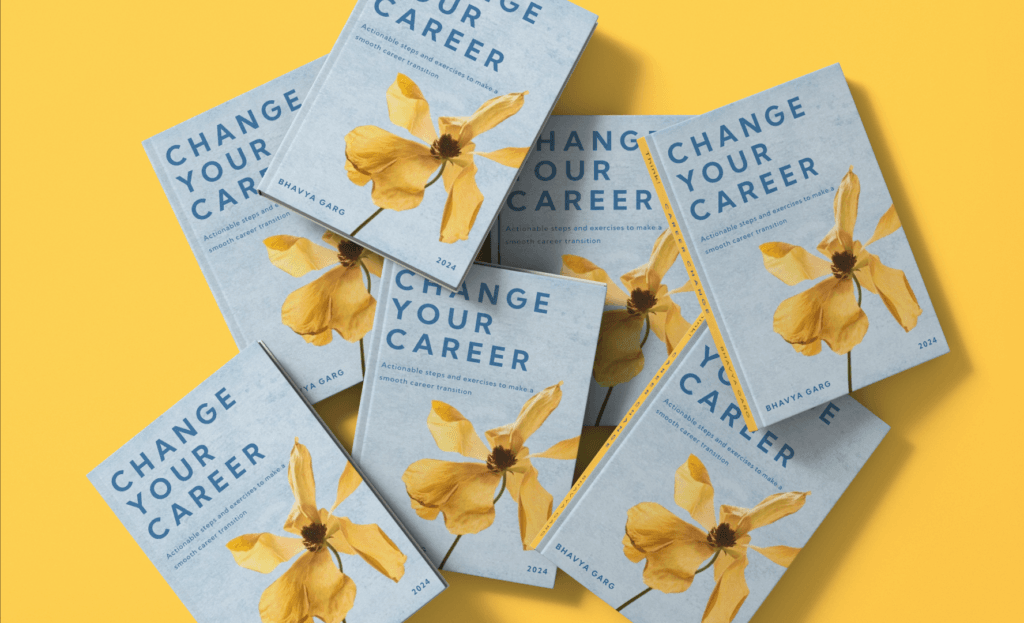
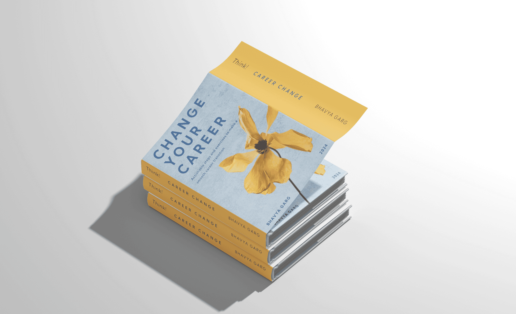
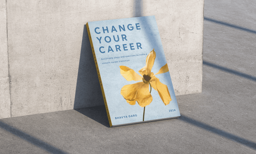
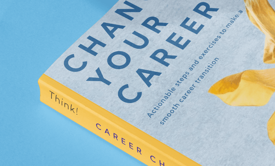
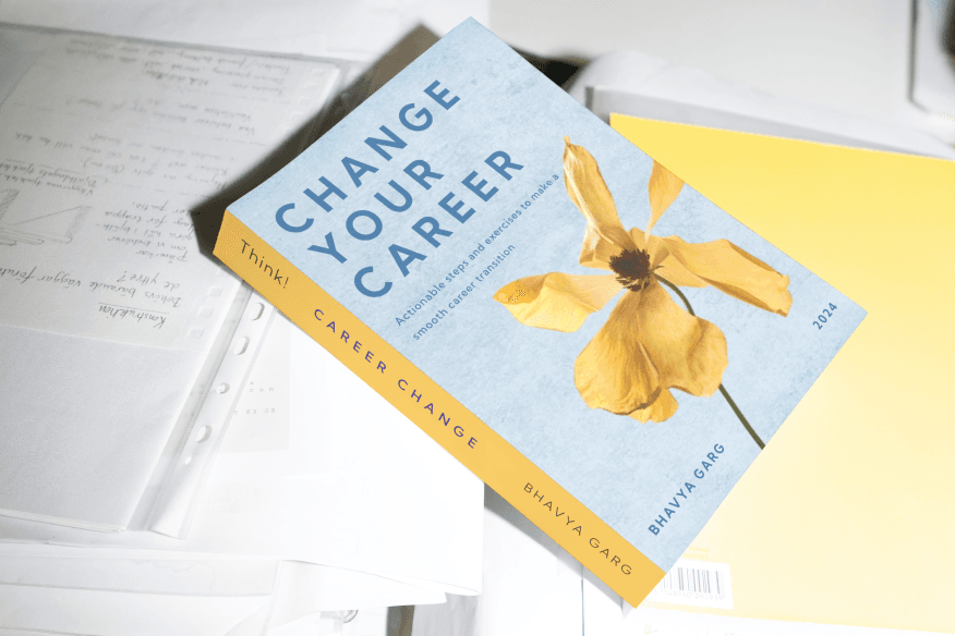
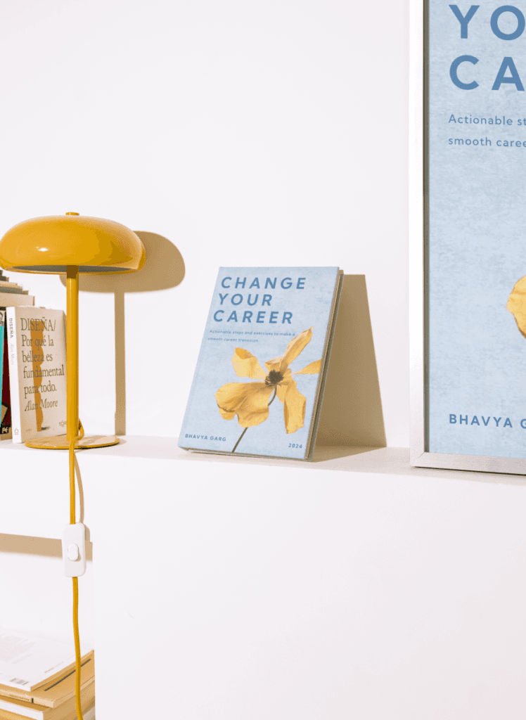
Book Cover Design: As part of its service offerings, Career Change planned to publish a series of guides and workbooks to help individuals navigate career transitions. MADnext designed a book cover that aligned with the company’s brand identity. The design utilized the company’s color palette and incorporated motivational imagery that resonated with the target audience.
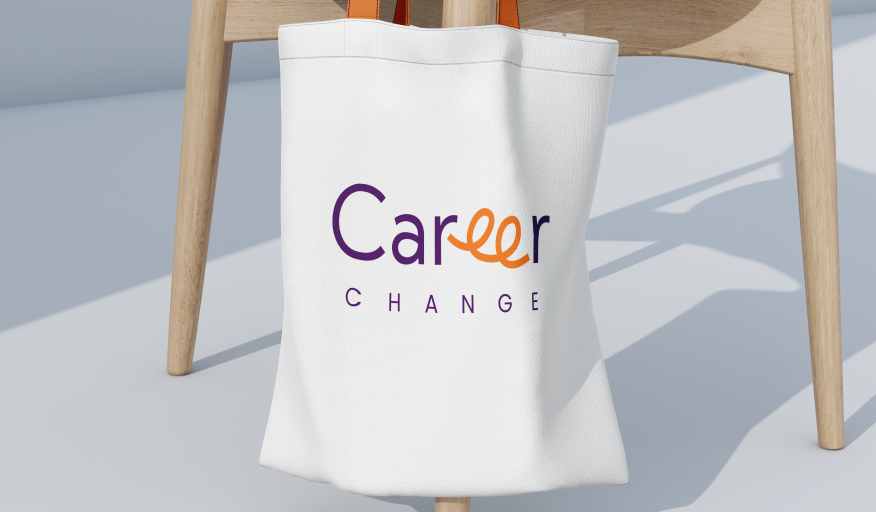
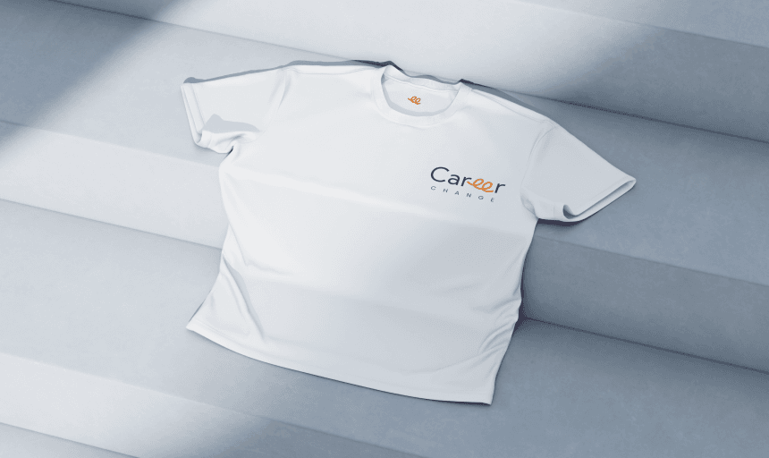
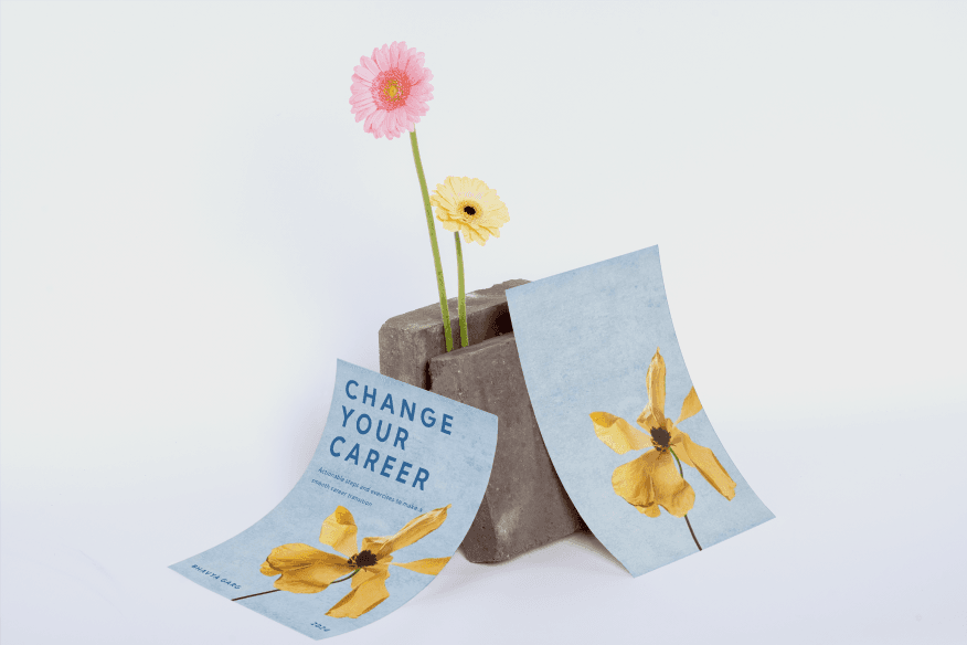
Merchandise Design: To further establish the brand, MADnext designed a range of merchandise, including t-shirts, and post cards. Each item was thoughtfully designed to reflect the company’s brand identity, using the logo and color scheme to create visually appealing and functional products. The merchandise served as both promotional items and tools for engagement, helping to build brand awareness and loyalty.
Brand Guidelines: Understanding the importance of consistency, MADnext developed comprehensive brand guidelines for Career Change. These guidelines covered all aspects of the brand, including logo usage, color schemes, typography, and tone of voice. The guidelines ensured that every piece of communication, whether digital or physical, adhered to the brand’s identity, fostering a cohesive and professional image.
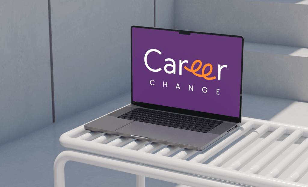
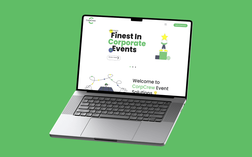
Website Development: MADnext developed a user-friendly, visually appealing website, transforming the online presence of Career Change. We focused on making the design more responsive, SEO optimization, and seamless navigation, ensuring the site reflects the essence of Career Change.
Change your Career
Results
The collaboration between Career Change and MADnext led to numerous positive outcomes
Strong Brand Identity: Madnext successfully established a unique and memorable brand identity that resonated with the target audience.
Consistent Visual Branding: The consistent design approach across the logo, book covers, merchandise, and other brand assets helped build strong brand recognition.
Clear Brand Guidelines: The comprehensive brand guidelines ensured that all communications were consistent, enhancing the professionalism and credibility of the brand.