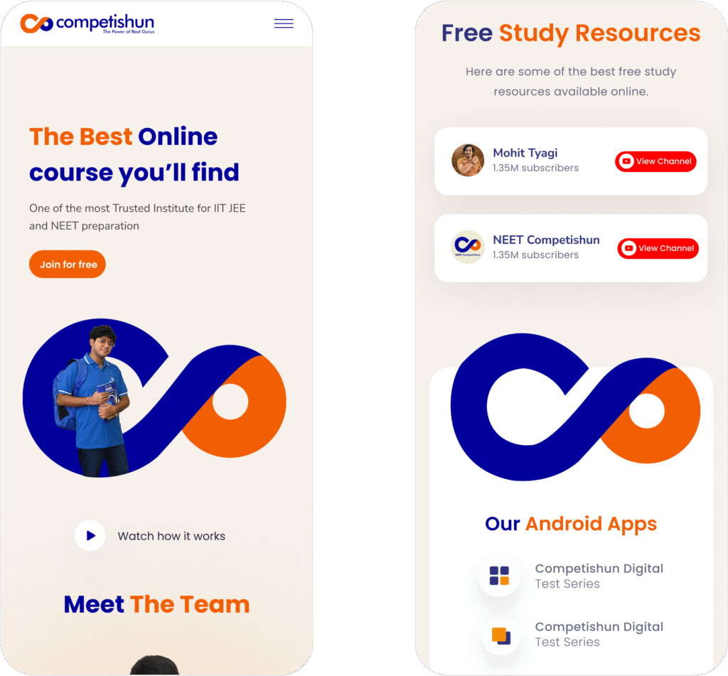
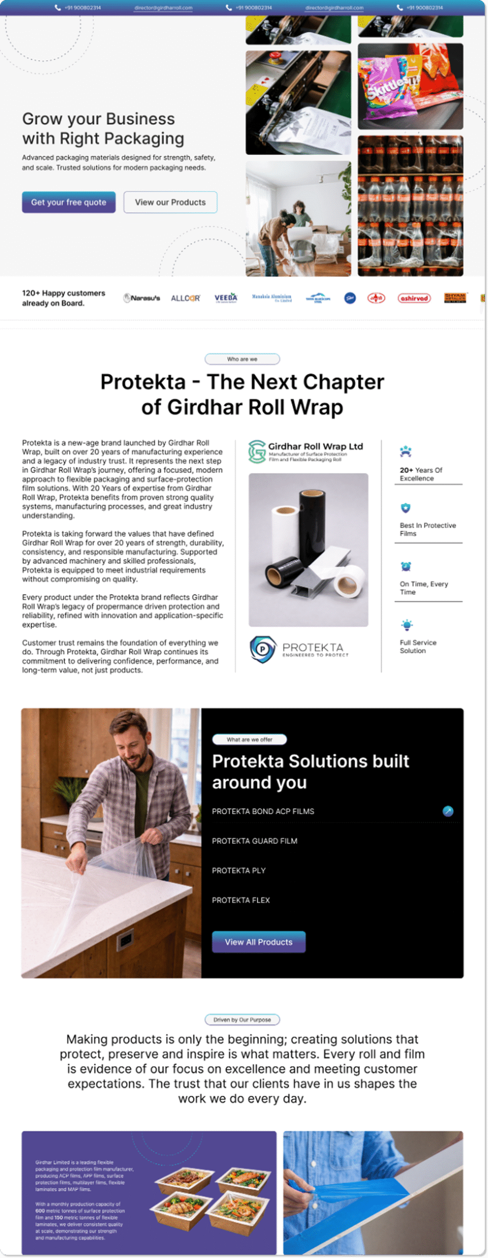
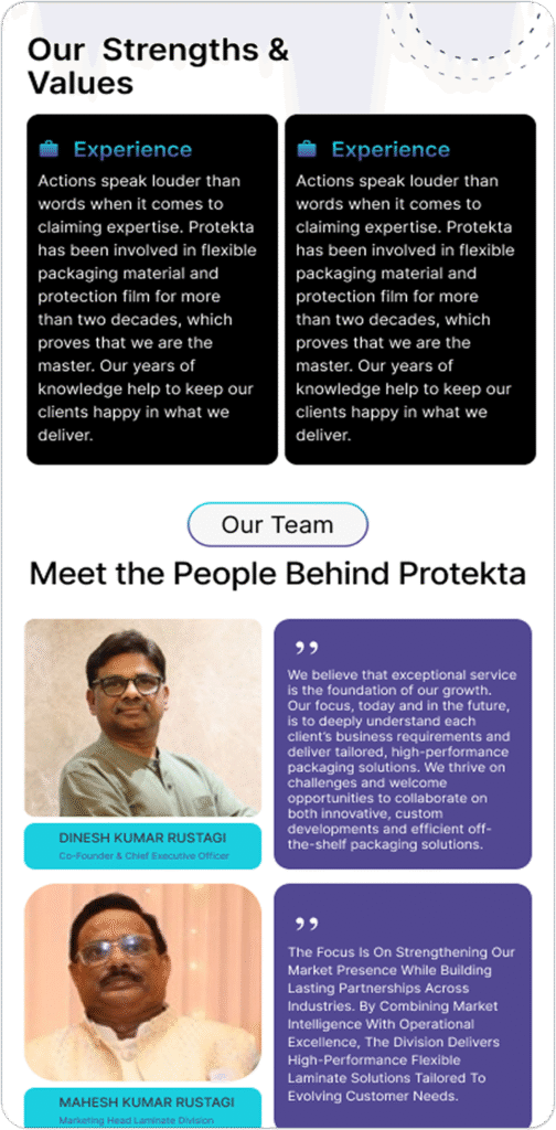
Protekta operates in the industrial packaging space, a category where credibility, scale, and reliability define trust. Backed by over 20 years of expertise from Girdhar Roll Wrap Pvt. Ltd., the brand’s real-world strength was undeniable.
However, its digital presence did not reflect that strength.
MADnext was brought in to redesign the website interface, transforming it from a static information portal into a modern, credible, high-trust industrial platform.
The Core Challenge
The issue wasn’t lack of information. It was lack of structure, energy, and direction.
The existing website faced five critical problems:
1. Low Interactivity
The interface felt flat and lifeless. No hover states. No visual feedback. No engagement triggers. Users had little reason to explore further.
2. Poor Spacing & Layout
Overcrowded sections and inconsistent spacing created visual fatigue. Elements competed for attention instead of guiding it.
3. Text-Heavy Pages
Large, unbroken content blocks overwhelmed users. Information wasn’t structured for scanning, making it hard to understand what Protekta offers and why it matters.
4. Disconnected Imagery
Generic visuals failed to communicate industrial scale, precision, or trust. The imagery lacked narrative and weakened credibility.
5. Weak CTA Presence
Minimal calls-to-action meant users weren’t guided toward enquiry or exploration. The journey lacked momentum.
MADnext Approach
We didn’t just redesign aesthetics. We redesigned perception.
Our objective was clear:
Make the website reflect the scale, professionalism, and reliability Protekta already delivers offline.
Step 1 — Audit & Diagnostic Mapping
We conducted a detailed audit of every page, documenting usability gaps, layout inconsistencies, and conversion drop-off points. Patterns emerged:
Cluttered content zones.
No clear visual priority.
Missing engagement triggers.
This diagnostic phase shaped the entire redesign strategy.
Step 2 — Applying Core UI Principles
Every design decision tied back to clarity and credibility.
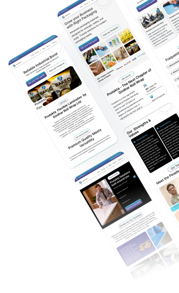
Major Screens
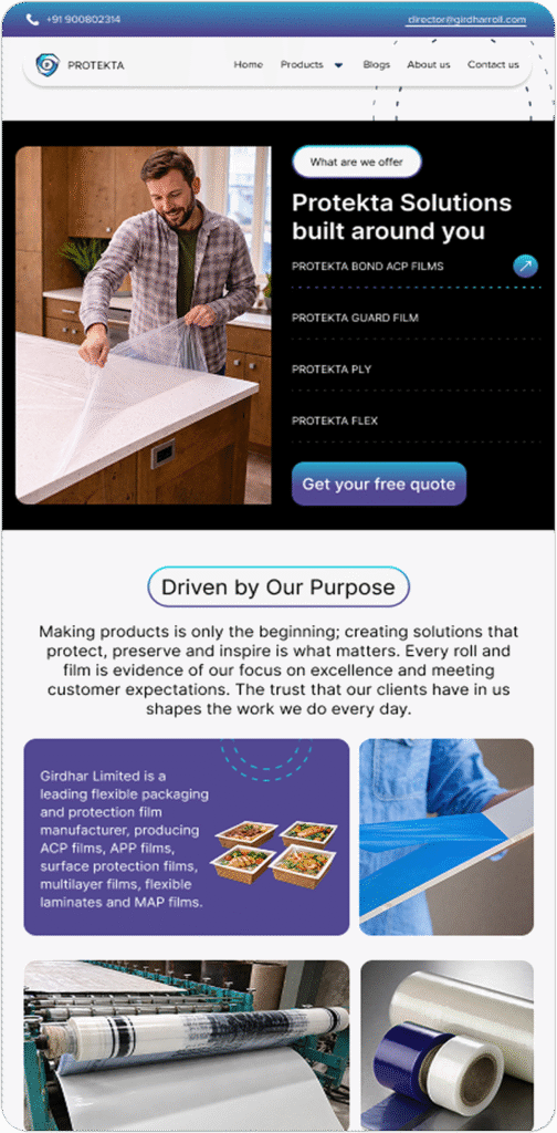
Step 3 — Layout & Spacing System
We restructured the interface using a defined grid system. Content was broken into clearly separated sections, allowing the eye to breathe. The new layouts ensured:
1. Faster scanning
2. Better readability
3. Clear sectional flow
Step 4 — Typography & Content Structuring
To eliminate text fatigue:
Long paragraphs were converted into structured blocks.
Clear headings and subheadings improved hierarchy.
Supporting text was simplified for clarity.
Users can now grasp Protekta’s value proposition at a glance and dive deeper when needed.
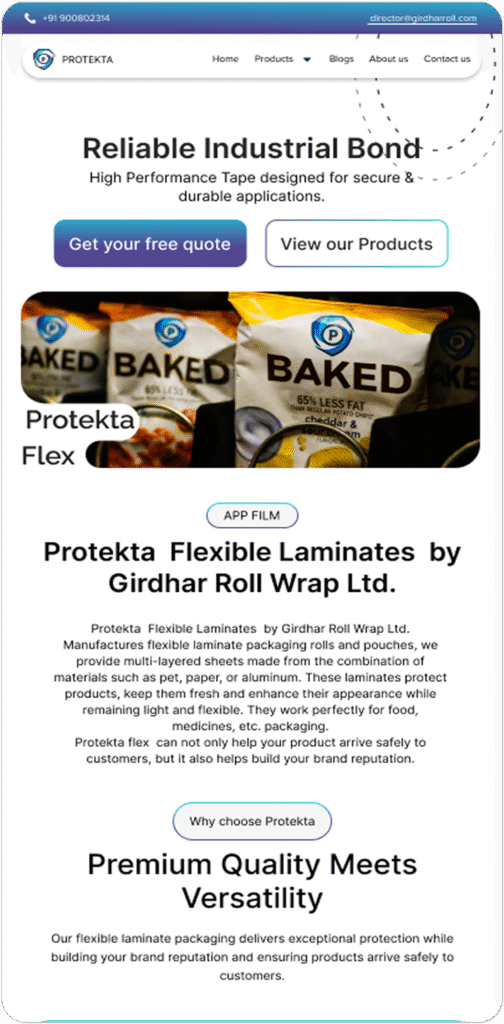
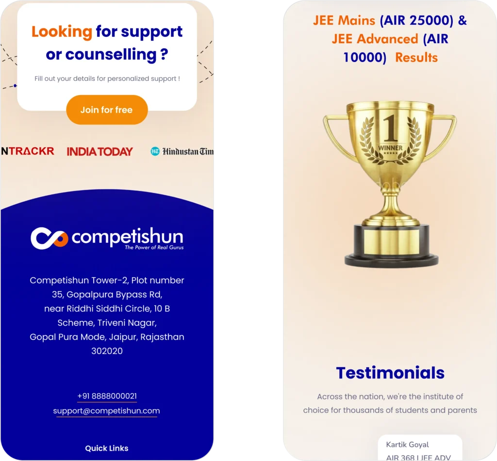
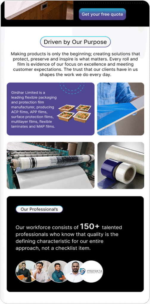
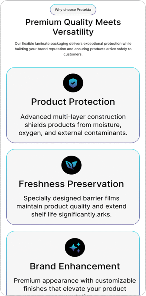
Step 5 : Visual & Image Direction
We replaced generic visuals with purposeful imagery aligned to the brand narrative.
The new visual direction communicates:
Far far away, behind the word mountains, far from the countries Vokalia and Consonantia, there live the blind texts. Separated they live in Bookmarksgrove right at the coast
Far far away, behind the word mountains, far from the countries Vokalia and Consonantia, there live the blind texts. Separated they live in Bookmarksgrove right at the coast
Far far away, behind the word mountains, far from the countries Vokalia and Consonantia, there live the blind texts. Separated they live in Bookmarksgrove right at the coast
These enhancements made the website feel dynamic, modern, and professionally engineered.
Major Screens
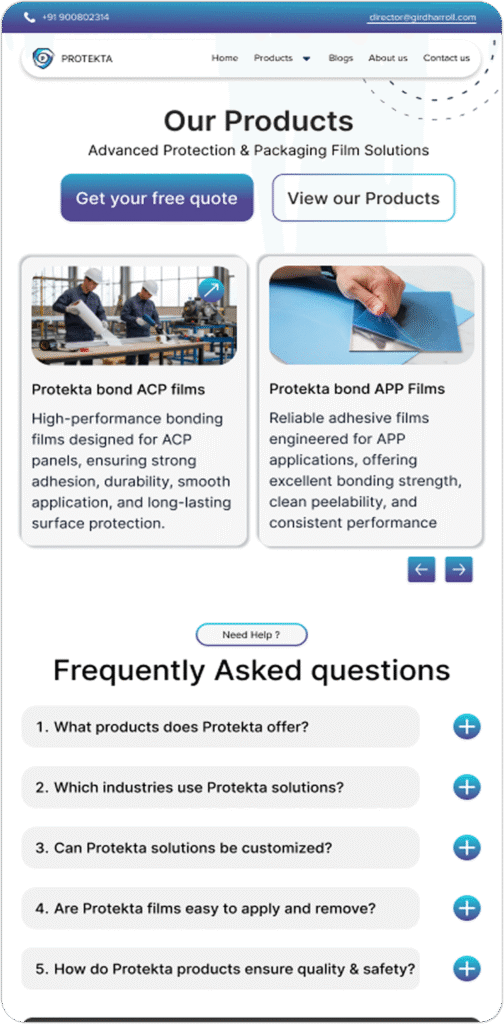
Step 7 : Strategic CTA Placement
We mapped the user journey across each page and inserted CTAs at psychological decision points. Each action prompt was:
Strategic Impact
Stronger First Impression : The interface now immediately communicates premium industrial capability.
Easier Navigation : Clear hierarchy and structured layouts allow users to find information quickly without friction.
Increased Engagement : Structured layouts, result highlights, and faculty emphasis build parental confidence.
Brand Alignment : Most importantly, the website now reflects the scale, professionalism, and 20+ years of expertise that Girdhar Roll Wrap Pvt. Ltd. represents.
The Bigger Outcome
In industrial sectors, trust is visual before it is verbal.
MADnext transformed Protekta’s website from a static catalogue into a digital authority platform — one that communicates reliability before a single conversation begins
Because when a brand looks engineered with precision, it is trusted with confidence
Get your free MAD Checklist Guide
Stay organized, stay ahead, and make an impact with confidence.
Get your free MAD Checklist Guide
Stay organized, stay ahead, and make an impact with confidence.
Get your free MAD Checklist Guide
Stay organized, stay ahead, and make an impact with confidence.
Get your free MAD Checklist Guide
Stay organized, stay ahead, and make an impact with confidence.
Join MADnext
Get your free MAD Checklist Guide
Stay organized, stay ahead, and make an impact with confidence.
Get your free MAD Checklist Guide
Stay organized, stay ahead, and make an impact with confidence.
Get your free MAD Checklist Guide
Stay organized, stay ahead, and make an impact with confidence.