The stated brief was brand identity. The real brief was coherence.
PNG wasn’t one business it was several. A B2B natural product trade operation on one side, a consumer-facing food experience venture on the other, with more verticals quietly forming in the background.
All of it needed to live under one name, one visual language, one identity that could walk into a corporate procurement meeting and stand behind a street-facing ice popsicle cart without flinching.
"That's not a logo project. That's an architecture project."
Five tensions. One identity.
No room to fudge any of them.
1. Global, without losing ground
Ambition without losing the cultural groundedness that gave it meaning in the first place.
2. Natural, not rustic
Needed to feel natural not rustic, not farmers market, not rough-hewn.
3. Premium, not cold
Premium but not untouchable not the kind of premium that keeps people at arm's length.
4. Professional, not soulless
Professional without the soullessness of corporate design.
5. Warm, not childish
Warm, without sliding into something childish.
The approach
PNG wasn't building a product brand. It was building a parent brand a foundation rigorous enough to hold categories that don't exist yet.
The temptation with natural brands is to reach for the obvious: earthy tones, hand-drawn textures, the visual grammar of farmers markets and wellness shelves. It’s a comfortable language. It also wasn’t right for PNG.
So before a single colour swatch or typeface was touched, we committed to a strategic premise that would anchor every decision that followed.
The premise
One brand. Multiple ventures. One natural foundation.
The rule
Every design had to serve the idea.
The logo
A symbol that earns its meaning.
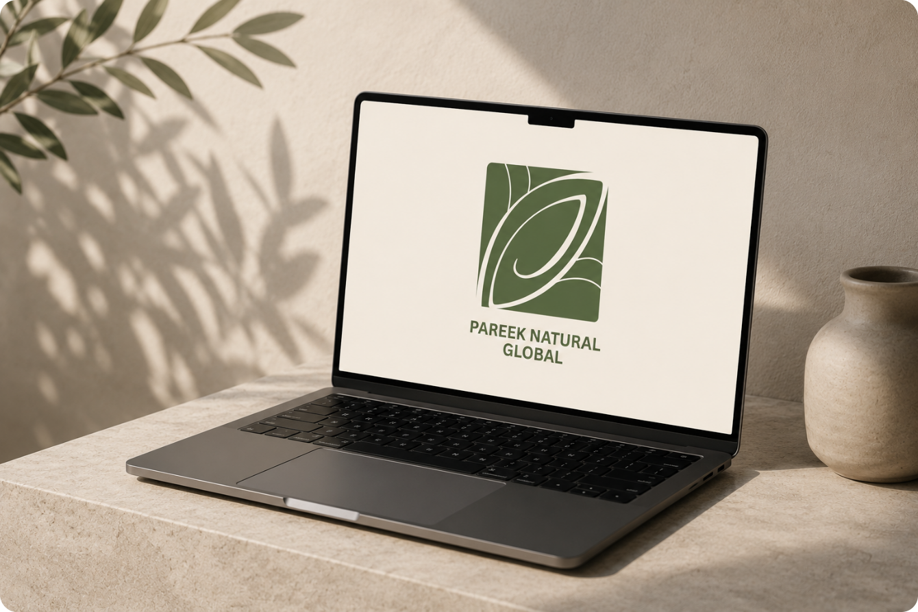
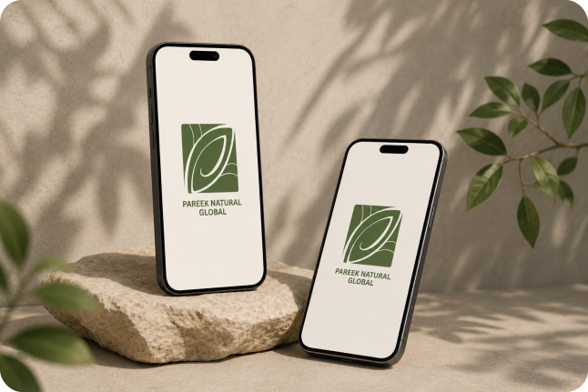
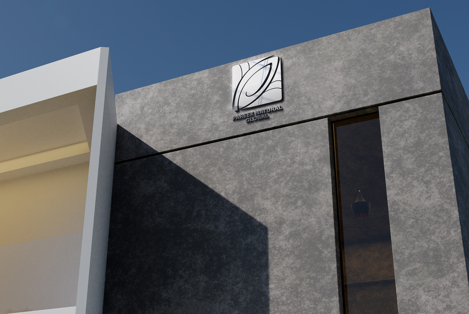
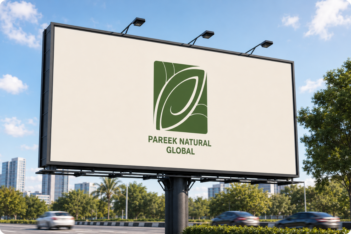
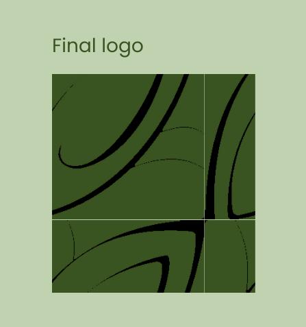
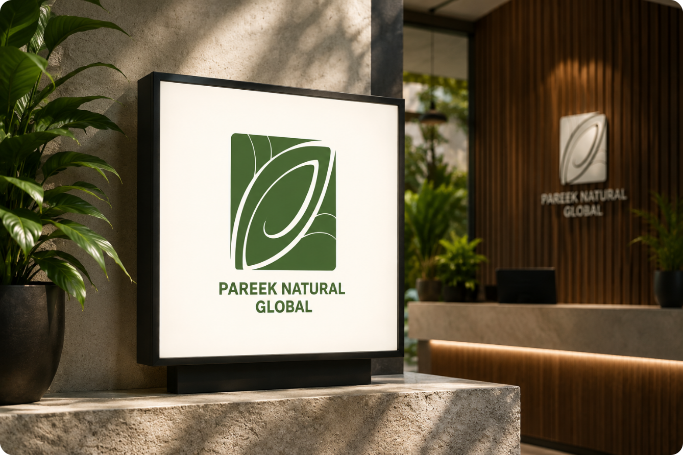
The PNG mark combines the letterforms P, N, G with the form of a peacock feather woven into the letterforms, not appended to them.
Typography & Color Palette
Personality without performance.
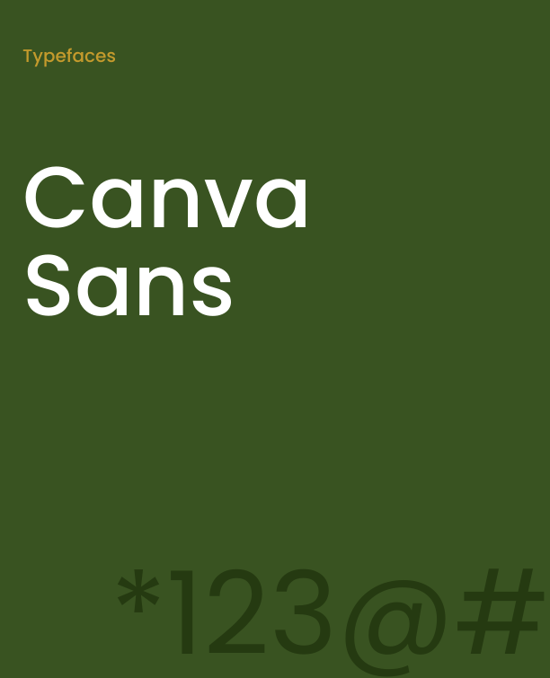
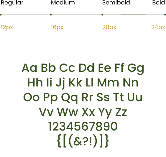
A refined serif for headings. A clean, functional sans for body and supporting text. Elegance that doesn’t sacrifice clarity.
Colour Palette
White Solid
#FFFFFF
What Changed
From offerings to ecosystem.
A strong parent brand identity doesn’t just make things look consistent it creates the internal clarity that makes growth easier. Every new venture that joins the system has somewhere to anchor. You’re not reinventing the brand with every expansion. The foundation is already there.
Before
Multiple offerings. No unifying story.
After
A connected ecosystem with a shared logic and room for what hasn't launched yet.
The work
Infrastructure, not artefacts.
Not a logo. Not a colour palette. Not a set of typography guidelines, in isolation a coherent system built to carry PNG into every context it operates in.
Brand Direction
The strategic premise anchoring every decision that followed.
Logo Concept & Development
Letterforms and feather, resolved as one mark.
Visual Identity System
Colour, type, and usage rules built to scale.
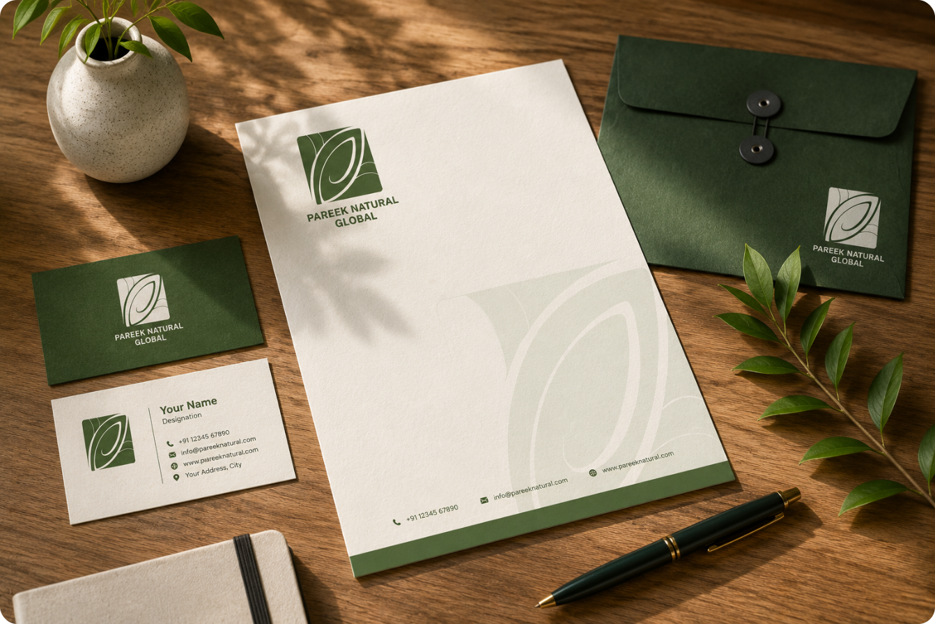
Brand Mockup Visualization
The identity proven across real-world touchpoints.
Stakeholder Presentation
The system communicated internally and externally.
Usage Guidelines
The rules that keep the system coherent as it grows.
MADnext Brand Strategy & Visual Identity
A brand rooted in nature. Built on trust. Designed for growth.
Get your free MAD Checklist Guide
Stay organized, stay ahead, and make an impact with confidence.
Get your free MAD Checklist Guide
Stay organized, stay ahead, and make an impact with confidence.
Get your free MAD Checklist Guide
Stay organized, stay ahead, and make an impact with confidence.
Get your free MAD Checklist Guide
Stay organized, stay ahead, and make an impact with confidence.
Join MADnext
Get your free MAD Checklist Guide
Stay organized, stay ahead, and make an impact with confidence.
Get your free MAD Checklist Guide
Stay organized, stay ahead, and make an impact with confidence.
Get your free MAD Checklist Guide
Stay organized, stay ahead, and make an impact with confidence.