Edit Content
Edit Content

How MADnext built Pravom from scratch and turned packaged water into a premium lifestyle brand with its own visual language.

Clients
PRAVOM

Scope
Logo, Symbol System, Pattern, Colour & Type, Guidelines, Packaging Mockups

Service
Brand Identity & Visual Systems

A Water Brand That Refused to Look Like One

Packaged water is one of the hardest categories to design for precisely because it feels so simple.

Most brands rely on the same visual language: water drops, mountains, shades of blue, and literal expressions of purity. The result is a category full of brands that feel familiar but rarely memorable.

Pravom came to MADnext looking for something different.

Not a better version of what already existed, but a new way of thinking about what a water brand could be.

That required more than design.

It required a point of view.

The Positioning

The strategic shift was simple but powerful:

Pravom wasn't going to be a water brand. It was going to be a wellness and lifestyle brand that happened to sell water That distinction changed everything. Water brands compete on purity and price.

Lifestyle brands compete on identity, aspiration, and emotion.

The identity needed to communicate purity, movement, trust, and innovation not through familiar category symbols, but through a visual language built exclusively for Pravom.
The Logo & Symbol System

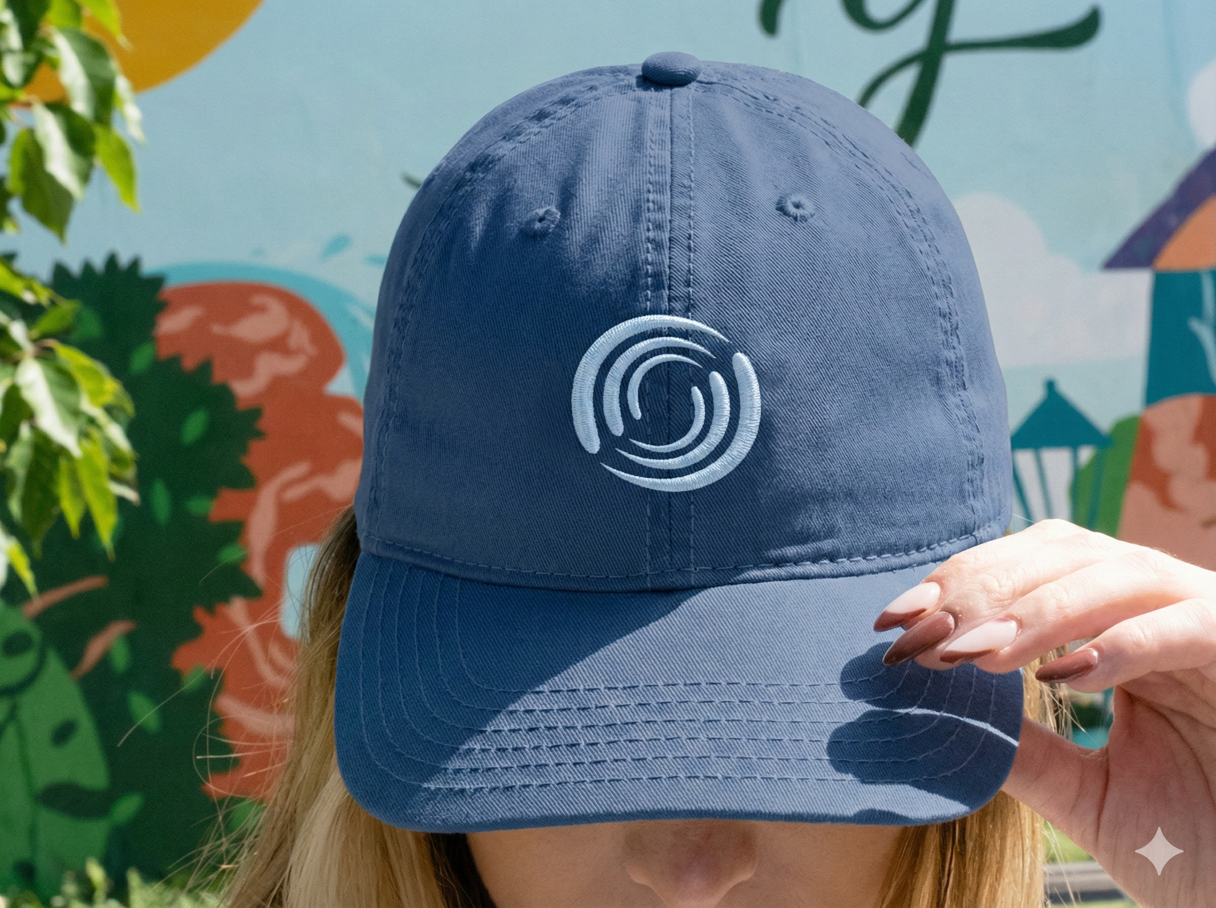
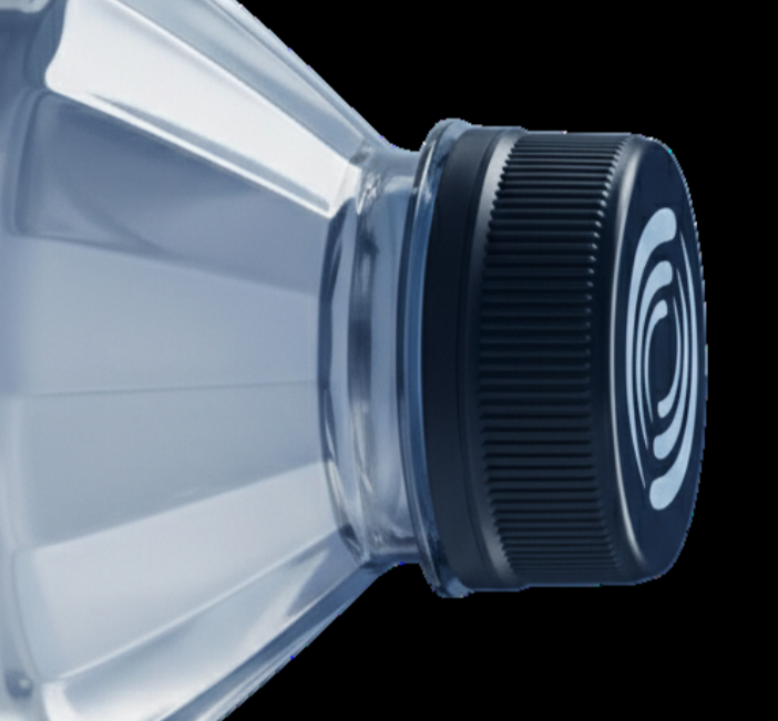
At the centre of the identity sits a custom symbol inspired by movement and circulation water not as a static resource, but as energy in motion.

Flow.

Rhythm.

Momentum.

The mark intentionally avoids category clichés. No water drops. No waves. No mountains.

Instead, it introduces a proprietary symbol designed to hold meaning, reward recognition, and perform consistently across every scale from bottle caps to billboards.

Not a better version of what already existed, but a new way of thinking about what a water brand could be.

That required more than design.

It required a point of view.

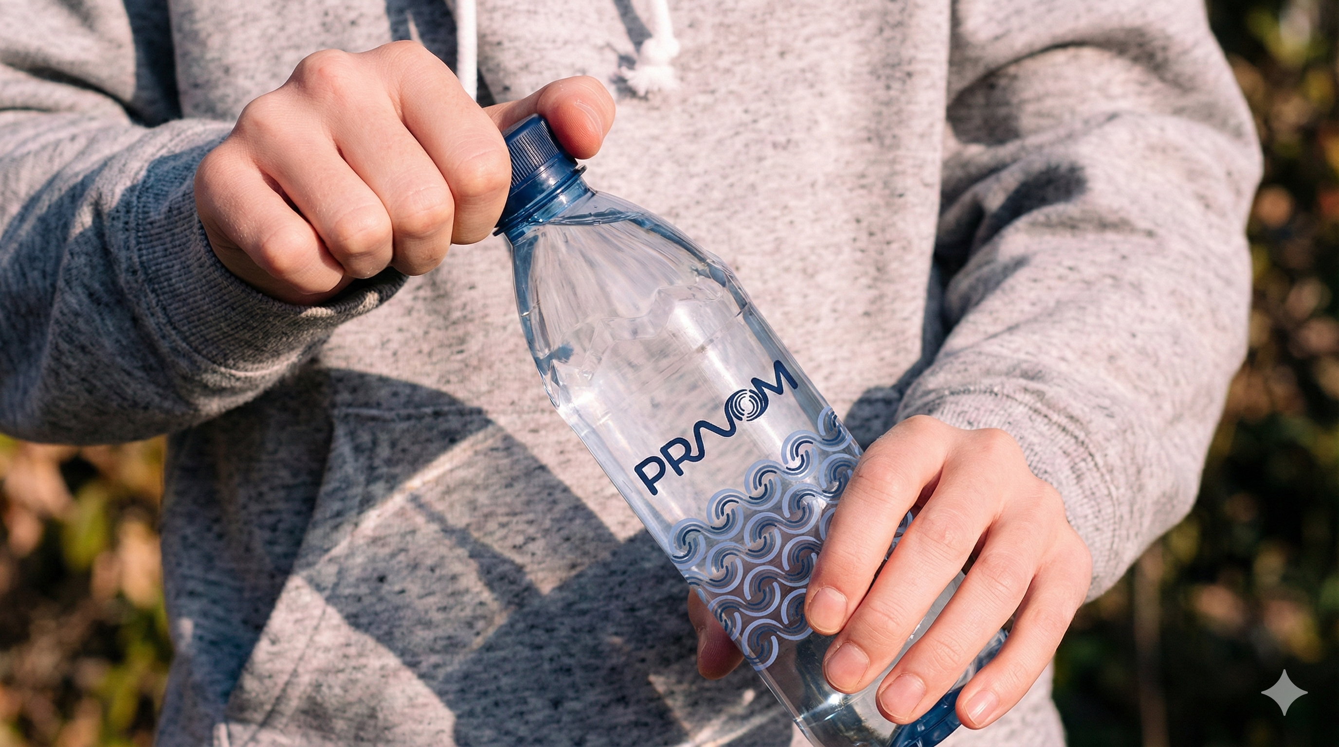
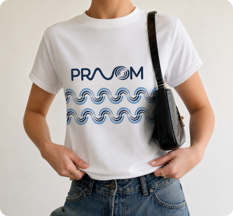
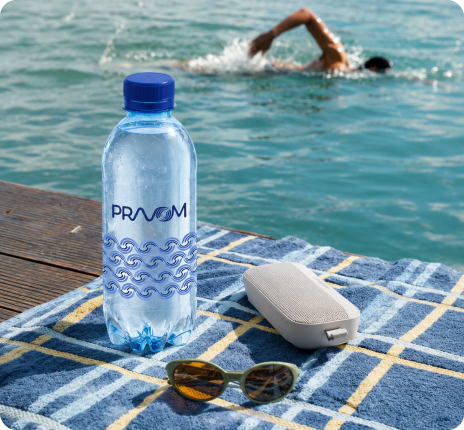
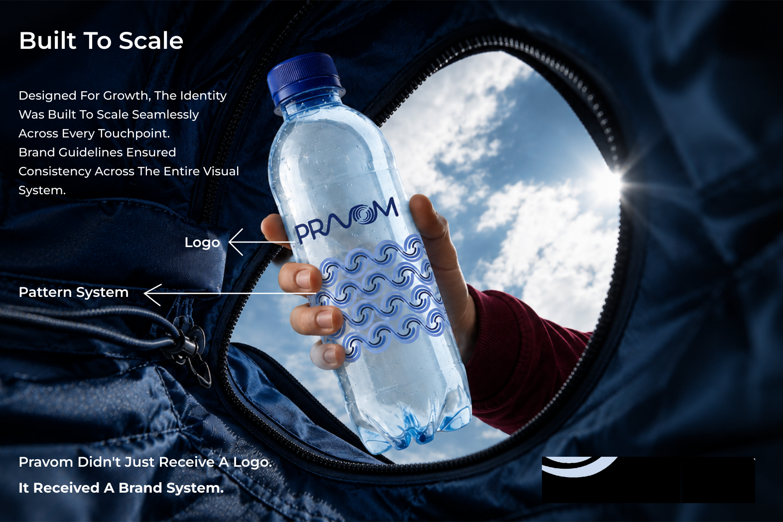
Applied across packaging, marketing,& environmental touchpoints, the system ensures the brand remains recognizable even before the logo appears. The result is a premium, bespoke visual asset that belongs entirely to Pravom.

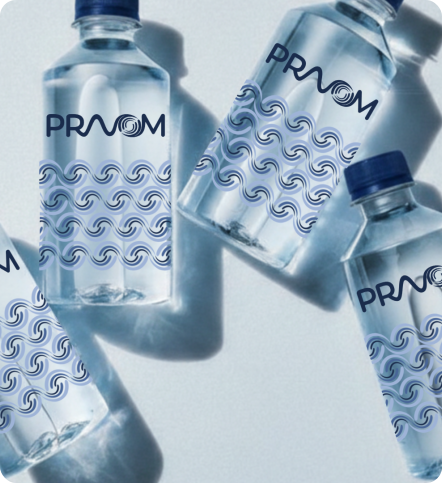
Where a logo identifies, a pattern creates recall.

The Pattern System

Derived directly from the logo symbol, the Pravom pattern became an extension of the brand's visual language.

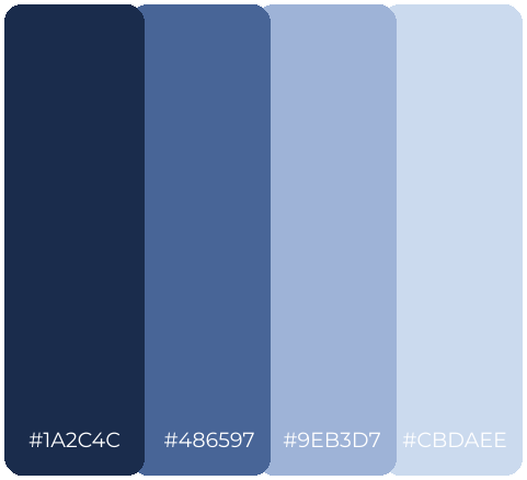
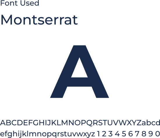
Colour, Typography & Tone

Typography followed the same principle clean, contemporary, and distinctive without becoming decorative.

Typography followed the same principle clean, contemporary, and distinctive without becoming decorative.

Together, they established a visual tone that feels modern, premium, and confidently positioned within the lifestyle space.

What Pravom Is Now

A water brand that refused to look like one. A distinct visual world built around its own symbol, language, & philosophy. Confident on the shelf because it looks unmistakably like itself.

Not water with a logo.
A brand with a point of view.

Scope of Work

Brand Identity• Logo Design • Custom Symbol System • Pattern Development • Colour & Typography • Brand Guidelines • Packaging Mockups

MADnext

Brand Identity & Visual Systems