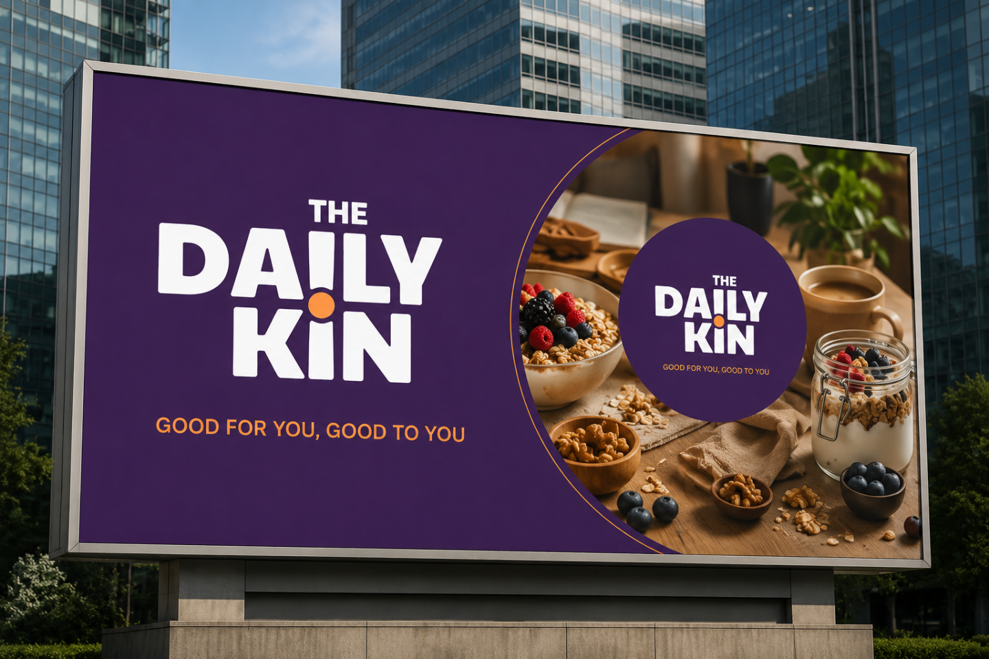
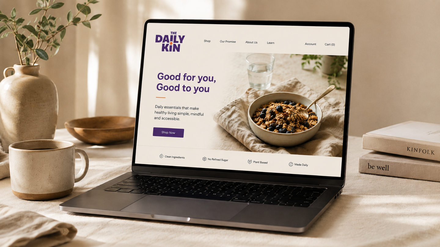
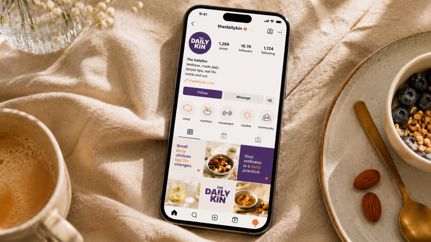
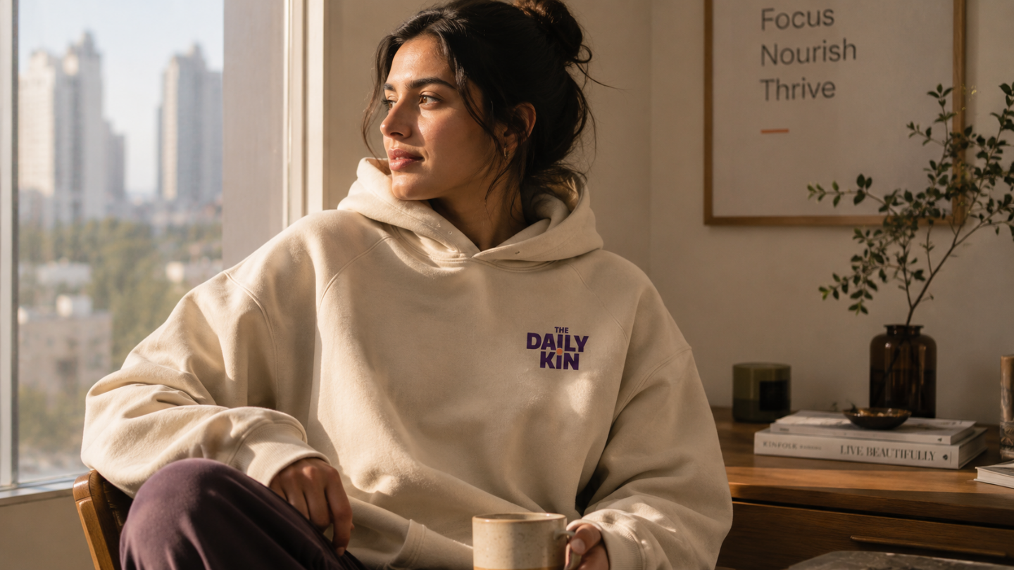
How MADnext built The DailyKin brand identity, a visual system designed around care, comfort, and the feeling of returning to healthy habits.
The DailyKin
Brand identity & visual systems
Health Food & Wellness
How MADnext built The DailyKin brand identity, a visual system designed around care, comfort, and the feeling of returning to healthy habits.
The DailyKin
Brand identity & visual systems
Health Food & Wellness
Most wellness brands make healthy living feel like a challenge. Their messaging is clinical, competitive, or demanding, leaving people feeling they need discipline before they even begin. The DailyKin was created with a different belief. Healthy eating should feel easier. Not harder.
MADnext's role was to translate that belief into a complete visual identity where every element, from the logo to the colours and visual language, reflected comfort, optimism, and everyday care.
The project began with a simple question:
Why do people return to healthy routines?
The answer wasn't discipline.
It was familiarity.
People return to habits that feel rewarding, comforting, and easy to maintain.
That insight became the foundation of the brand.
Instead of celebrating nutritional achievement, the identity focused on emotional wellbeing.
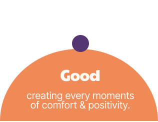
This thinking naturally led to the brand positioning:
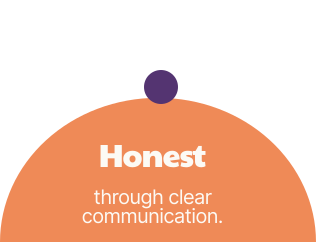
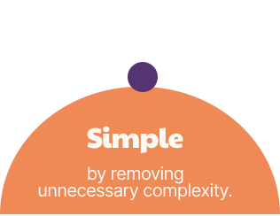
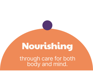
The DailyKin needed to feel warmer than traditional wellness brands and more approachable than performance driven health culture. Four qualities shaped the identity:
The result is a brand that feels like a trusted companion rather than a health authority.
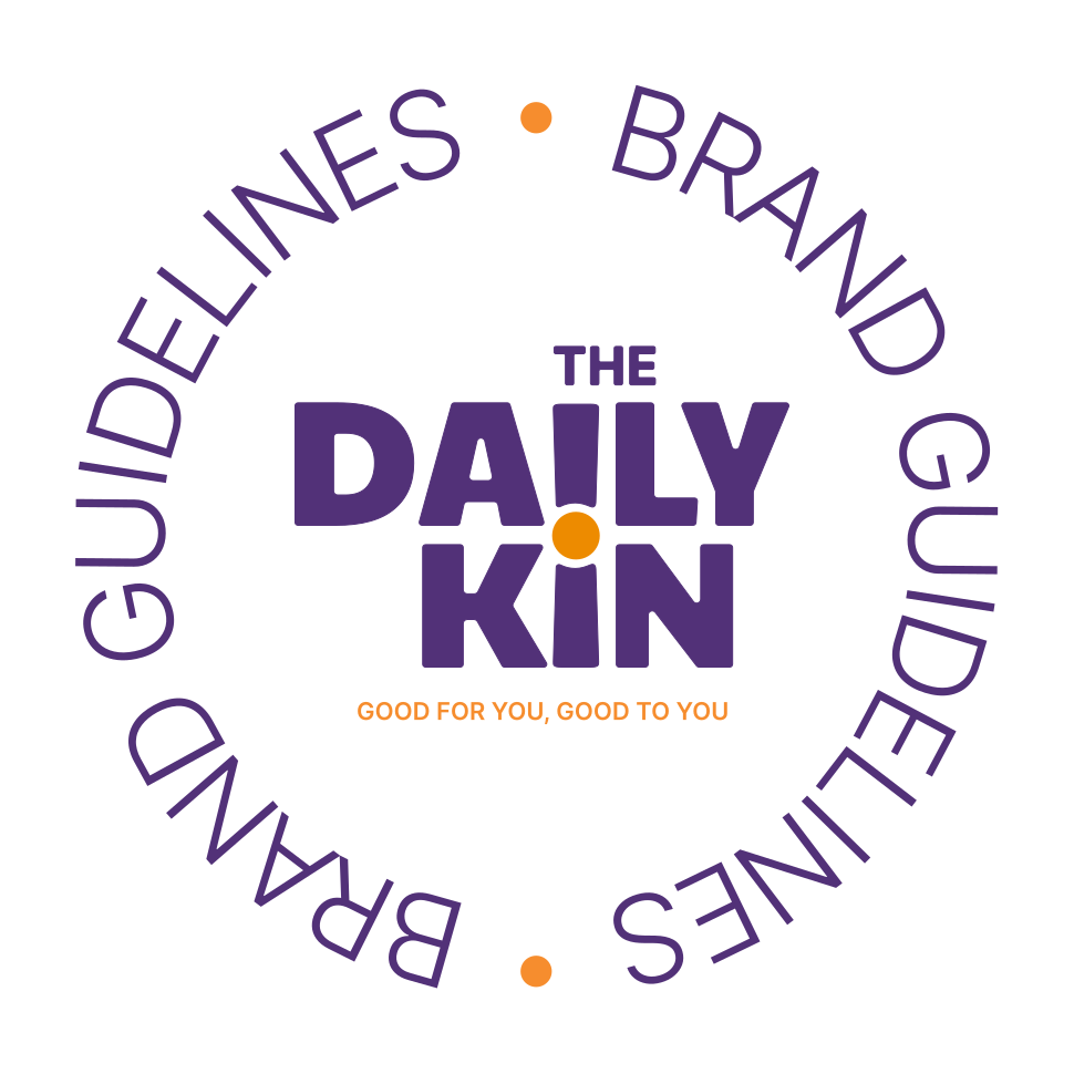
The logo was designed as a single integrated system.
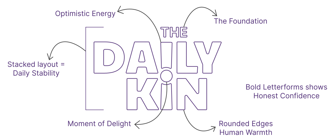
The shared "i" connects DAILY and KIN, symbolising routine, connection, and consistency.
The central dot represents care and presence, while a subtle hidden exclamation mark introduces optimism without overwhelming the identity.
Rounded forms create warmth.
The stacked structure adds stability.
The result is a logo that communicates personality before a single word is read.
The shared “i” structurally connects DAILY and KIN into a single uninterrupted form, symbolizing the relationship between everyday nourishment and dependable companionship. Rather than existing as separate ideas, the two become interconnected through one shared center point.
The dot acts as the emotional core of the identity:
1) A point of care
2) A moment of positivity
3) A subtle reminder of daily well-being.
Together, the structure also forms a hidden exclamation mark, introducing a quiet sense of encouragement and optimism into the logo.
Its structured layout creates a sense of balance and consistency, while the central accent element represents a small daily moment of connection, care, and nourishment.
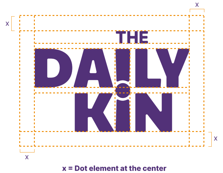
Maintaining generous clear space around the DailyKin logo helps preserve its warmth, readability, and visual calmness across every touchpoint. The logo should always feel breathable, balanced, and easy to recognize without surrounding clutter or competing elements.
Always maintain minimum clear space equal to the height of the orange accent element on all four sides of the logo. No text, imagery, patterns, or graphic elements should enter this area.
The DailyKin logo should always appear as a complete lockup. The logo is never separated into individual elements, abbreviated forms, or standalone symbols. Consistency helps preserve familiarity, trust, and recognition across the brand ecosystem.
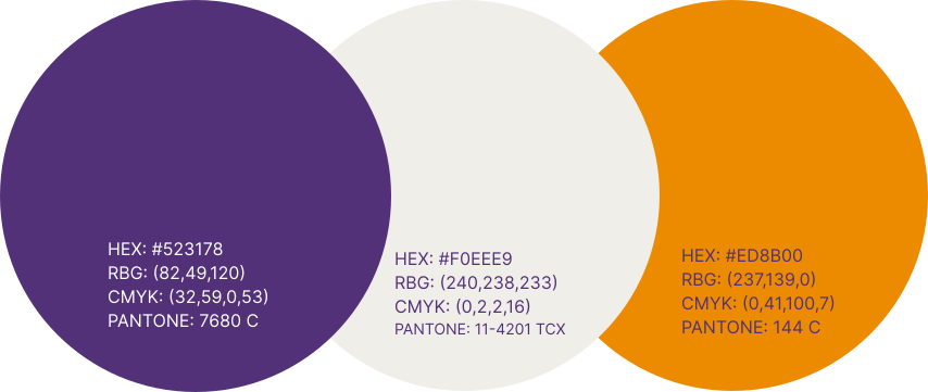
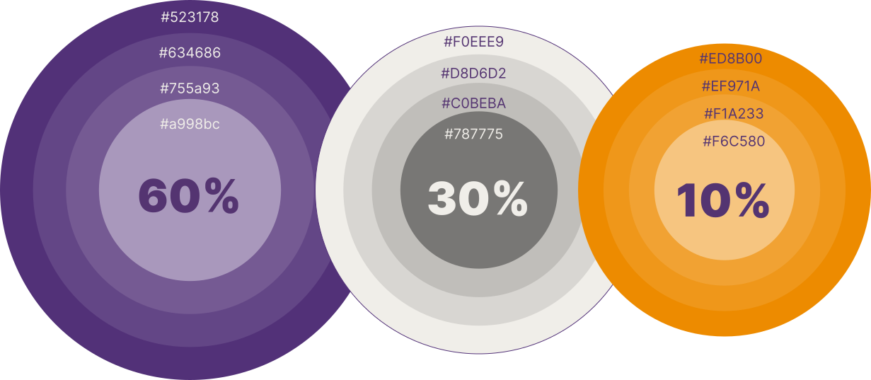
Rather than following the category's expected green palette, The DailyKin chose a more distinctive direction.
became the primary colour, giving the brand warmth, trust, and a premium presence.
introduced balance and simplicity.
added optimism and energy while highlighting key brand moments.
Together, the palette created a distinctive identity that stands apart while remaining approachable.
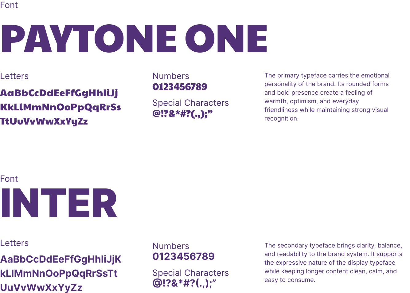
The typography system balances personality with clarity.
provides bold, friendly expression for headlines.
ensures readability across every touchpoint.
Together they reflect the same balance found throughout the brand:
Warmth with structure.
Character with clarity.
MADnext created two complementary visual systems that extend the identity across every application.
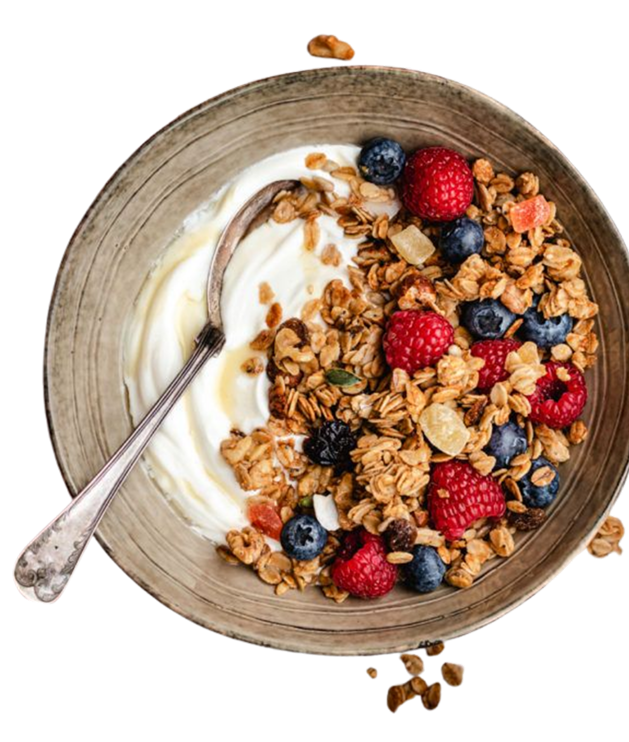
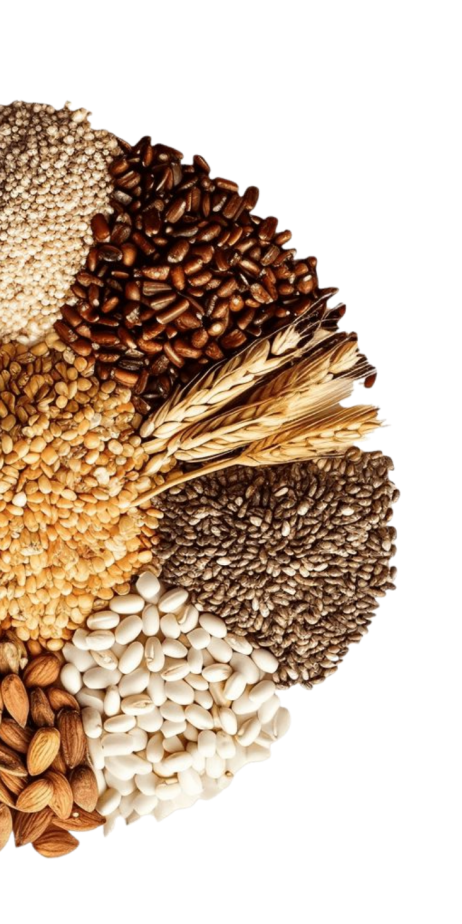
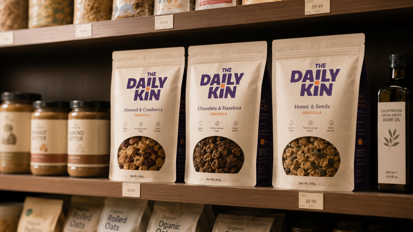
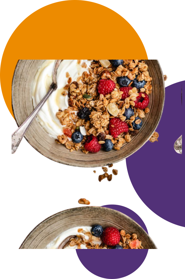
The Bowl System, inspired by the product itself, uses circular forms to represent nourishment, comfort, and daily rituals.
The Exclamation System, derived from the hidden logo element, introduces optimism and positive energy throughout the brand.
Together they create a visual language that feels calm, encouraging, and instantly recognisable.

The brand guidelines were designed to be clear, approachable, and practical.
Rather than simply defining rules, they explained the thinking behind every design decision, ensuring consistency while allowing the brand to grow naturally.
A brand identity rooted in emotional wellbeing rather than nutritional claims.
A logo with layered meaning.
A distinctive colour palette.
A flexible typography system.
A scalable visual language.
Comprehensive brand guidelines.
And one simple belief carried through every decision:
Healthy living should never feel harder.
It should feel good to come back to.
Brand Identity • Logo Development • Colour Strategy • Typography System • Visual Language Design • Brand Guidelines
Brand Identity & Visual Systems
Congratulations on completing your fitness goal by scrolling from Top to Bottom, we will add a MADness badge to your fitness profile.
Get your free MAD Checklist Guide
Stay organized, stay ahead, and make an impact with confidence.
Get your free MAD Checklist Guide
Stay organized, stay ahead, and make an impact with confidence.
Get your free MAD Checklist Guide
Stay organized, stay ahead, and make an impact with confidence.
Get your free MAD Checklist Guide
Stay organized, stay ahead, and make an impact with confidence.
Join MADnext
Get your free MAD Checklist Guide
Stay organized, stay ahead, and make an impact with confidence.
Get your free MAD Checklist Guide
Stay organized, stay ahead, and make an impact with confidence.
Get your free MAD Checklist Guide
Stay organized, stay ahead, and make an impact with confidence.