From Information Overload to Admission-Driven Clarity
Competishun is a high-performance coaching institute preparing PUC students for competitive exams like IIT-JEE and NEET. While their academic credibility was strong, their digital experience did not reflect the same structure, ambition, or clarity.
MADnext was brought in to transform the website into a high-conversion, academically authoritative platform, built specifically for PUC students and their decision-making parents.
The Core Challenge
1. Information Overload
Courses, batches, results, materials, faculty, all important, but poorly structured. The result? Cognitive fatigue.
2. No Clear Student Journey
Students were left wondering:
Which course fits me?
Where do I start?
How do I enroll?
Without guided flow, decision-making slowed down.
3. Weak Visual Hierarchy
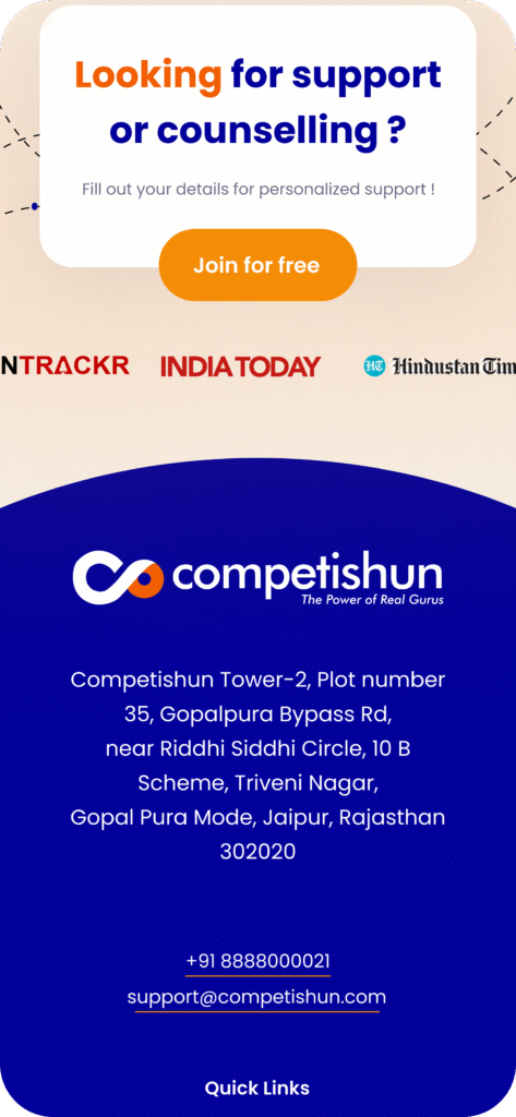
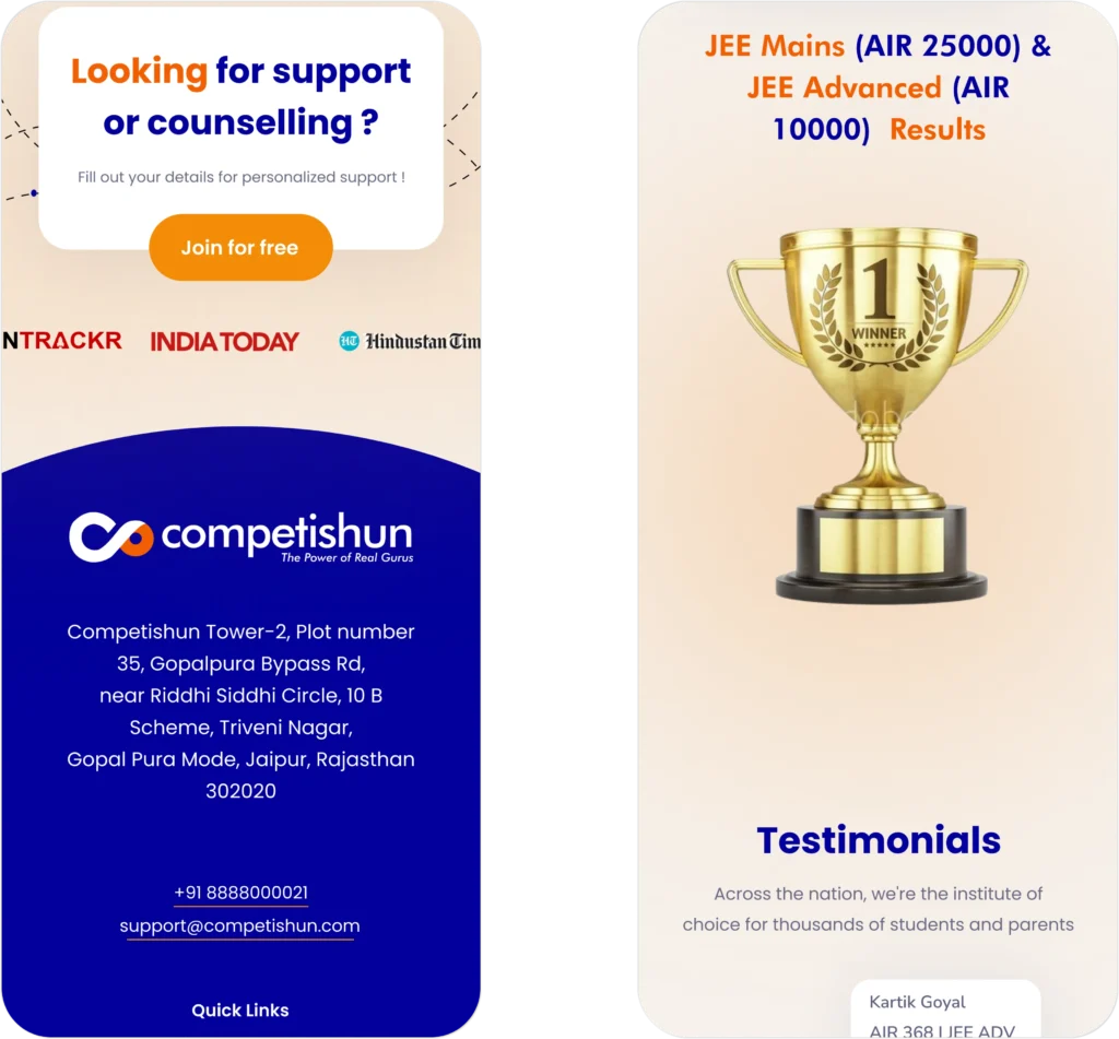
Critical sections like Results, Admissions, and Course Benefits lacked prominence, reducing trust and engagement.
4. Limited Emotional Impact
For aspirants, motivation matters. For parents, credibility matters. The website needed to inspire both ambition and reassurance.
5. Conversion Gaps
Admissions are the business goal. Yet CTAs were not strategically placed at psychological decision points.
MADnext Approach
We didn’t redesign pages. We redesigned the student decision journey.
Our focus was clarity, structure, and conversion, without overwhelming the user.
Step 1 — Audience Intelligence
We analysed:
Coaching competitors
Student browsing behavior
Parent expectations
Competitive exam platforms
Two core audiences shaped the UX strategy:
PUC Students — : Crafted a sleek, modern logo symbolizing precision and clarity.
Parents — Seeking credibility, structure, and results.
The interface had to balance energy and seriousness.
Step 2 — Information Architecture & Sitemap
The goal was to create a smooth journey from awareness → trust → action.
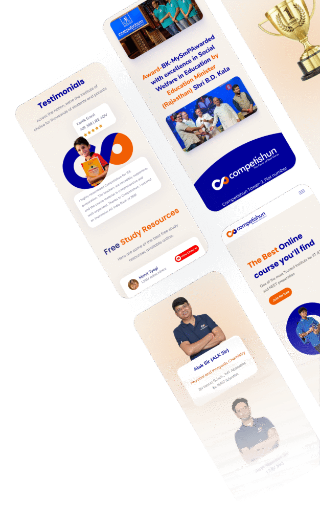
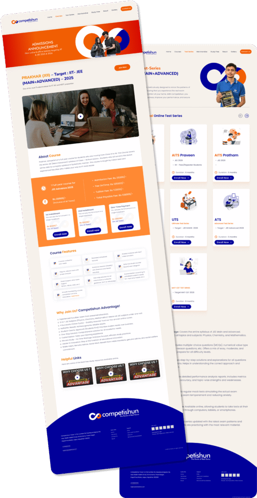
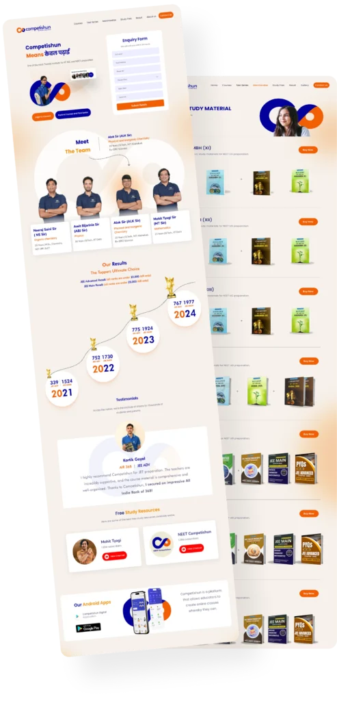
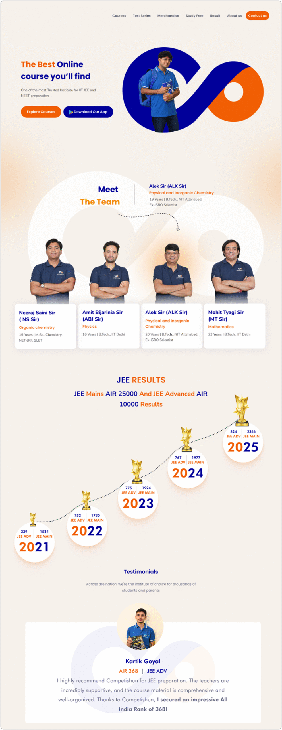
Major Screens
Step 3 — UI System & Visual Hierarchy
1. Strong visual hierarchy
2. Grid-based alignment
3. Strategic whitespace
4. Clear CTA hierarchy
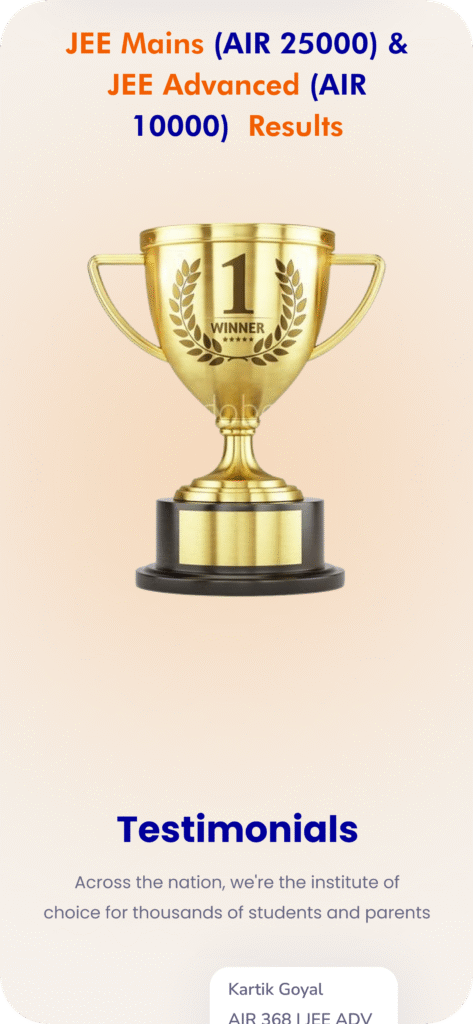
5. Contrast-led emphasis on Results & Admissions
Important metrics like ranks, results, and success rates were visually elevated reinforcing credibility instantly.
The goal was fast scanning, minimal cognitive load, and academic authority.
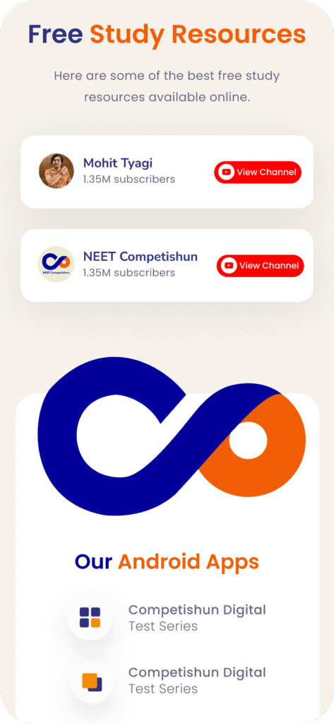
Step 4 — Content Structuring for Clarity
To prevent text fatigue:
Content was broken into digestible sections.
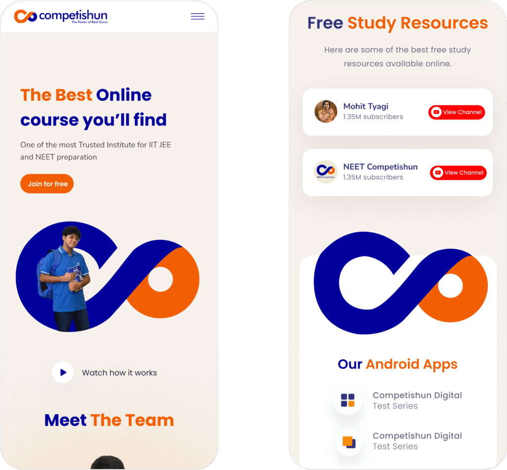
Course benefits were displayed in card formats.
Tables for batches were clean & structured.
Bullet formats improved readability.
Each layout was designed to feel organised, serious, and exam-focused.
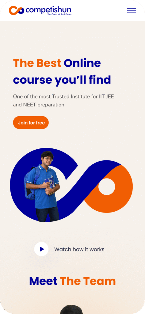
Step 5 : Visual & Brand Direction
The visual direction focused on:
The interface balances energy (to motivate students) and trust (to reassure parents).
Step 6 : Interactivity & Modern UX
To avoid a static coaching-site feel, we introduced:
These elements made the platform feel responsive and modern.
Major Screens
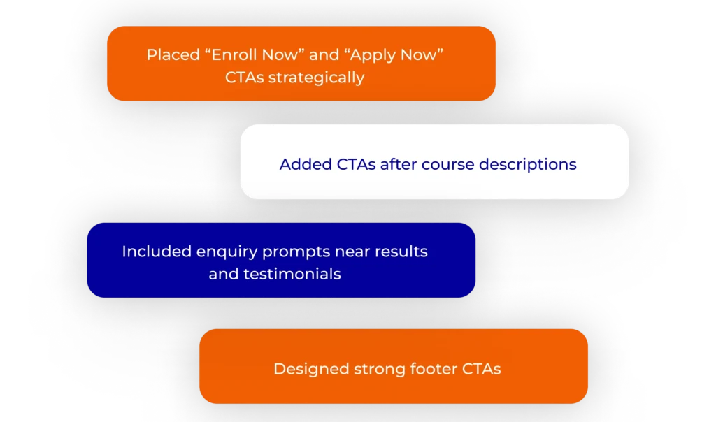
Step 7 : Conversion Strategy
Admissions drive revenue. So CTA placement was engineered, not added. we
Each CTA aligned with user psychology, appearing exactly when clarity turned into intent.
Strategic Impact
Stronger Academic Positioning :The interface now reflects seriousness, discipline, and competitive excellence.
Improved Decision Clarity : Students can quickly understand programs, batches, and outcomes.
Increased Trust :Structured layouts, result highlights, and faculty emphasis build parental confidence.
Balanced Appeal :The design speaks to both ambition-driven students and outcome-focused parents .
The Bigger Outcome
A coaching institute prepares students for structured exams. Its website should reflect the same structure.
MADnext transformed Competishun’s website from an information-heavy portal into a guided academic journey — engineered for clarity, credibility, and conversion.
Because when clarity increases, confidence follows. And when confidence follows, admissions do too.
Get your free MAD Checklist Guide
Stay organized, stay ahead, and make an impact with confidence.
Get your free MAD Checklist Guide
Stay organized, stay ahead, and make an impact with confidence.
Get your free MAD Checklist Guide
Stay organized, stay ahead, and make an impact with confidence.
Get your free MAD Checklist Guide
Stay organized, stay ahead, and make an impact with confidence.
Join MADnext
Get your free MAD Checklist Guide
Stay organized, stay ahead, and make an impact with confidence.
Get your free MAD Checklist Guide
Stay organized, stay ahead, and make an impact with confidence.
Get your free MAD Checklist Guide
Stay organized, stay ahead, and make an impact with confidence.