

Edit Content
Edit Content

Where Craft
Meets Contemporary

Clients

Vari

Service

Brand Identity

Building Vari Jaipur’s visual identity around an existing submark foundation.

Some brand projects begin with a blank page. This one began with a constraint.

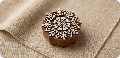
Vari Jaipur came to MADnext with an existing submark already in place.

The challenge was to build everything around it the logotype, typography, colour system, hierarchy, endorsement system, and brand guidelines creating a visual identity that felt cohesive from the start. That is often harder than starting from scratch. Every design decision had to support and strengthen something that already existed.

The Brand

That duality shaped every choice we made.

Vari Jaipur is a premium brand rooted in traditional Indian craftsmanship with a visual ambition that reaches well beyond it. The positioning sits at the intersection of heritage and contemporary the kind of brand that needs to feel at home in a boutique in Jaipur and credible in a global market simultaneously.

The Challenge

When the submark is a given, the surrounding identity has to work harder.

Typography, colour, and layout couldn't just be good in isolation they had to feel inevitable alongside a mark they weren't designed with. The risk of getting this wrong is visible in a second: a logotype that fights its submark, a palette that pulls in a different direction, a hierarchy that makes the brand feel assembled rather than considered.

MADnext's job was to make none of that visible. To make the full identity feel like it was conceived as one thing.

The Challenge

When the submark is a given, the surrounding identity has to work harder.

Logo Lockup & Hierarchy

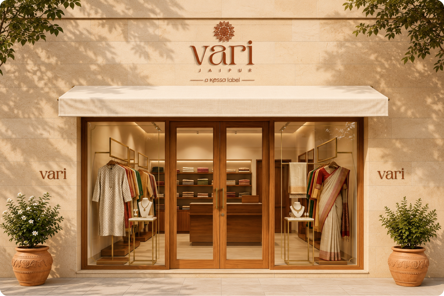
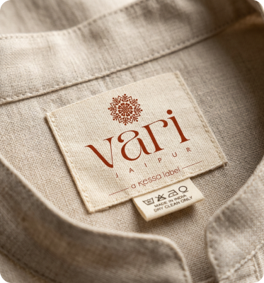
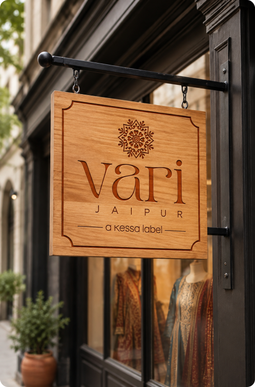
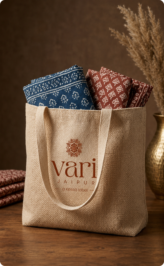
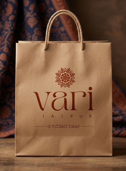
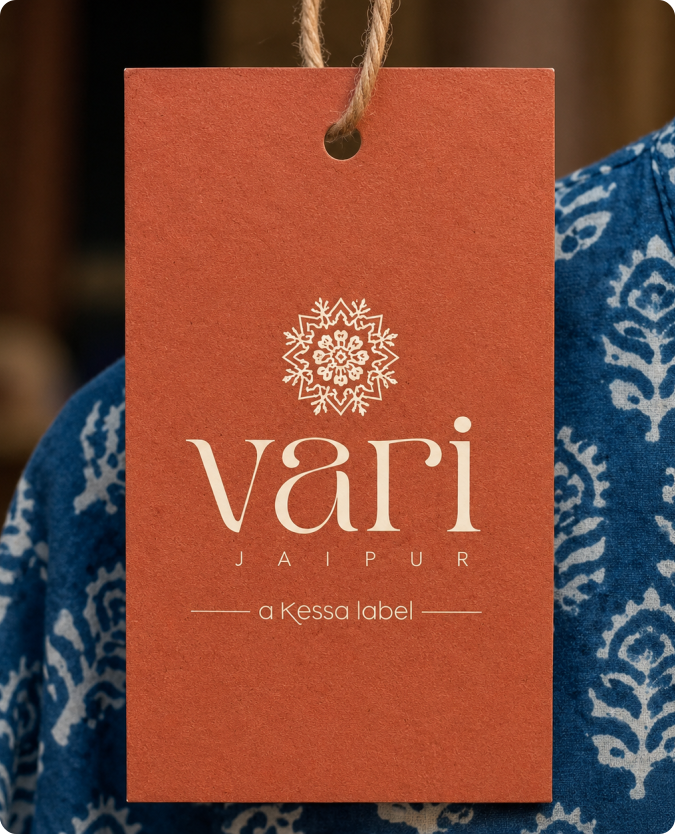
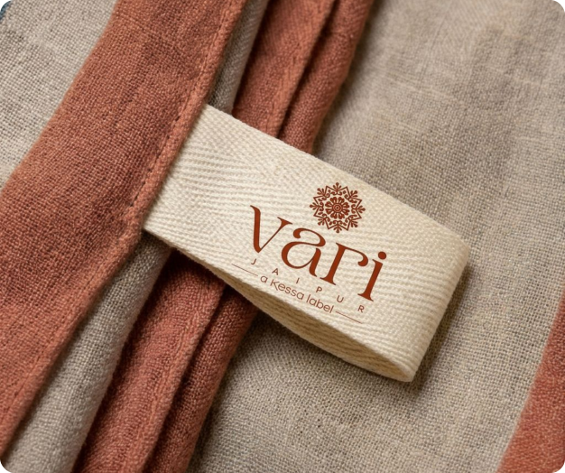
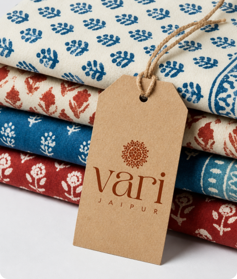
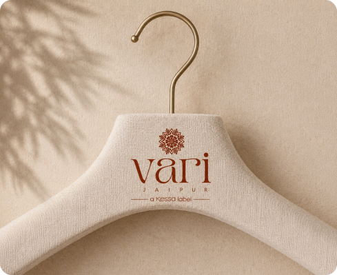
Developed a complete logo system defining how the logotype and submark work together across scales, layouts, and contexts.

Colour Palette

Created a visual direction that balanced the brand's Indian craft heritage with the restraint expected of a globally positioned premium brand.

Brand Endorsement System

Established clear rules for how Vari and Kessa relate to one another, ensuring consistent endorsement and hierarchy across touchpoints.
Typography

Selected and refined a primary typeface that complemented the submark while carrying the premium character required across packaging, digital, and print applications.

Brand Guidelines

Delivered a comprehensive system covering logo usage, spacing, typography, colour, and applications, enabling consistency at scale without constant design intervention.
The Outcome

A visual identity for Vari Jaipur that holds together premium, considered, and rooted enough to carry the weight of traditional Indian craft while looking forward at the same time.

The submark they brought in. The brand around it, that's MADnext.

Scope of Work

Typography •  Logo System • Colour Direction • Brand Endorsement Guidelines • Brand Guidelines Document.

MADnext

Brand Identity